
Charts and graphs are too often used as synonyms. Both are important data visualizations, but they've got key differences.


Each format for charts and graphs has its place, but the choice depends on the type of data you're working with. The debate of chart vs graph comes down to the story that you seek to tell, as well.
Your points will land with the audience when you choose the best graphic for the occasion. What is the difference between a chart and a graph, and when should you choose each? Let's find out.
Charts Vs Graphs (Quickstart Video)
Are you trying to decide between using a graph and a chart right now? Quickly find out the difference between a chart and a graph in the video below:
To learn more about charts and graphs, continue reading the tutorial.
Jump to content in this section:
Charts Versus Graphs (What's the Difference?)
When you’re sharing information, it’s a great idea to use visuals. Trying to explain data through words alone is a good way to confuse an audience. By illustrating key points, you can bring your ideas to life in a stylish way that's easy to understand.
Charts and graphs are the best way to do this. Both are data visuals that bring clarity to your message. Often, people use the terms chart and graph interchangeably - but in reality, there’s a difference.
What is a chart? Visual representations of data. They may take many different forms, and style data in different ways. What a chart does is essentially convert your data into a visually digestible format. What a chart does not do is showcase how a change in one variable (such as spending) influences a change in another variable (such as sales).
This is where graphs come in. While graphs have a narrower definition, they are great at showing how one variable affects another. They use data plotted on a grid with axes representing two variables.
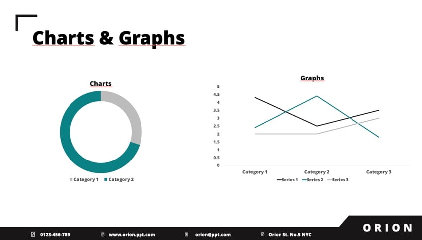


Thinking to yourself “what is the difference between a chart and a graph?” Graphs are numerical in nature, whereas charts can represent broader sets of data.
Deciding to use a chart vs graph is the key first step in creating data visuals to share with others. There’s not an automatic right answer. Both charts and graphs are vitally useful to visualize data. The trick is to choose the one that works best for you.
Data visuals are meant to tell stories. You need to tell your story in a way that's easy to understand. Your data visual should assist you in this task. Ensure that you use the simplest possible option. The last thing you want is your visual aid to be a confusing distraction.
Let’s explore some of the key principles of charts vs graphs. First, consider the benefits of using a chart, and when they work best. What is a chart used for?
- Charts show how data fits together. Imagine that you need to show total sales, split off by country. Visuals like a pie chart work well for this.
- Charts show how data variables relate to each other. Have dozens of pieces of data, and need to visually compare them? Bar charts and pie charts help express this at a glance.
- Charts offer greater flexibility. With charts, you can craft data visuals that showcase statistics, proportions, and more.
Graphs hold an important place, too. So, what is a graph used for?
- Graphs are great for numerical data. If you’re showing growth rates, sales increases, or similar details, graphs are your best bet. They plot individual data points on a two-axis grid layout.
- Graphs are simple to understand. A simple line graph can be understood with limited supporting context. All you need are axis labels. The graph’s data points do the talking.
- Graphs show how variables interact. Trying to show how a change in one variable impacts another variable? A two-axis graph communicates this in style. For example, you can show how increasing advertising boosts profits.
Charts and graphs both offer key advantages. Both serve as key upgrades over text-heavy slides! Think of the benefits of each and select the design that works best for your project.
Once you adopt the mindset of data visuals, you've got a new choice to make. Chart vs graph - which is right for you, and what are examples of the best case for each? Read on to find out more.
When to Use a Chart
Now that we’ve explored the benefits of charts and graphs, it’s time to dial in and learn how to create them. We’ll start by exploring charts and taking a look at how to build them.
What is a chart used for? Charts are your best bet if you need flexibility. They’re powerful tools that you can use to explain how datasets fit together and relate to each other.
Charts come in an array of styles and sizes. This gives you the versatility you need to create visuals that accurately show off your data. What a chart does really well is demonstrate how individual data fits into the overall “big picture.”


Again, your first goal should be to choose a chart that works best for your specific purpose. Consider the story that you want to tell. Choose the chart that fits.
Chart Example List
Still wondering what is a chart? Let's take a look at a chart example list and examine some popular chart styles, as well as explore when you should use them:
Bar (Column) Charts
Bar/column charts illustrate data by placing each element in a rectangular bar. Bars vary in length by their relative size. Bar charts work well when you’re plotting increasing or decreasing values, or comparing multiple variables to each other.


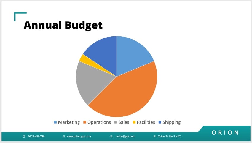
Pie Charts
Pie charts are circular and represent how portions of a total dataset form the whole. For example, you can use them to highlight how a total budget is allocated, or to analyze sales data.


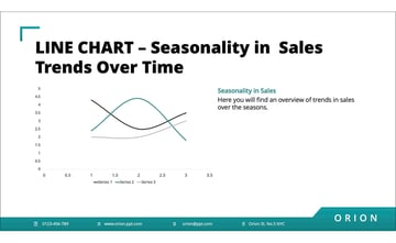
Line Charts
Line charts connect individual data points with a line. Line charts are most useful to illustrate trends in a dataset: up, down, or neutral. For example, you could use these to track seasonality in sales.

What About the Chart vs Diagram Debate?
While diagrams are a related visual tool, they've got an important distinction from charts. A diagram, such as a Venn diagram, is less about displaying numerical data, and more about representing a bird’s eye view of information in a way that shows how they relate to each other, and often where they overlap.
The decision to use a chart vs a diagram comes down to what your needs are for your presentation. Are you trying to portray specific numerical data, or an over-arching idea?
When wondering if you should use a chart vs a diagram, think about the type of information you’re working with, and whether that data is numerical in nature. Your chart vs diagram thought process should be one that considers the kind of information you have, and how you need to display it.
How to Customize a Chart
Once you’ve selected your chart type, it’s time to get to work customizing it. Let’s say that you run a business with five departments. You’ve built an annual budget, and you want to illustrate how the total budgeted dollars are allocated. This is the perfect time to use a pie chart.
We’ll be working with the Orion Presentation Template from Envato Elements. Download it to follow along.


To insert a chart, first navigate to a slide in the deck. In this example, I’ll use slide #9. As you can see, it's got plenty of open space to add a chart. At the top, I’ve added a title to bring some context to the chart.


To add charts and graphs to your PPT, begin by going to the Insert tab. This is found on PowerPoint’s ribbon, at the top of your screen.
On the Insert tab, click on the Chart drop-down menu. You’ll see an array of options display. We want a pie chart, so hover over Pie. Then, choose one of the thumbnails by clicking it. These change the look and feel of your chart.


When you choose one, a Microsoft Excel window opens inside your PowerPoint file. Placeholder text displays, showing off sales figures. To add your own data, swap out this existing text as you can see below.


PowerPoint automatically updates your chart as you add and customize data. In moments, you’ll have a stylish chart that’s easily understood at a glance.
Now, when you ask yourself “what is a chart?”, you’ll know they’re a breeze to create in PowerPoint.


When to Use a Graph
We’ve answered your question, “what is the difference between a chart and a graph?” Now, it’s time to focus on graphs and explore their top use cases. Graphs, again, have a narrower purpose and work well for specific types of data. Consider the examples below. If they fit your data, a graph is a good choice for you.
- Your data has two variables. Each variable can be plotted on its own axis: one vertical, one horizontal.
- You’re tracking correlation. This happens when you expect a change in one variable to drive a change in a different variable. Correlation is tough to map out with charts, but easy to do with a graph.
- You've got a large amount of data. Large datasets can easily be condensed in graph format. Huge datasets often clutter charts but can be succinctly illustrated with a chart.
Graph Example List
Still wondering exactly what is a graph? Let's take a look at a couple examples for clarification. As mentioned earlier, graphs are primarily numerical in nature, and have a narrower function than charts. Thus, we've got two examples below:
X-Y Scatter Graph With Lines
This is the most common type of graph, and commonly features both an X-axis and a Y-axis with the numerical data scattered on the graph. The data points are connected with lines, which are great at demonstrating the correlation between two variables. You can clearly see how one value affects the value of another. 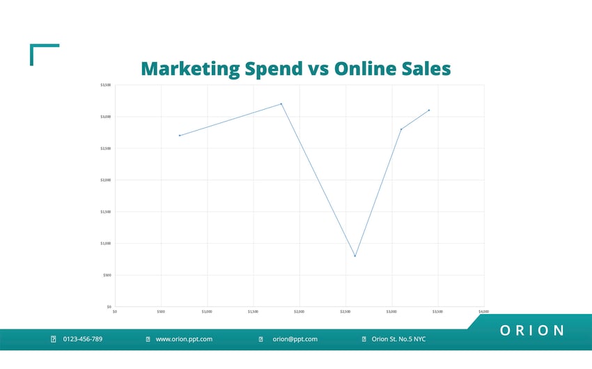


X-Y Scatter Graph Without Lines
This type of graph features multiple data points scattered on a graph without lines connecting them. They also utilize the two-axis grid layout. It focuses on the correlation between data points and how they cluster in one area more than another.


What About the Table vs Graph Debate?
Here's another important distinction worth briefly discussing. While tables also display numerical data, it simply lists them out. Depending on how much data you have, this can quickly become overwhelming to your viewers.
A graph, on the other hand, visually represents large amounts of data in a way that can be easier for your audience to understand. The decision to use a table vs graph comes down to how big your dataset is.
So, when wondering if you should use a table vs graph, consider how much data you have, and how you want to display it. The table vs graph distinction is an important one understand.
How to Use a Graph
What is a graph example that showcases its benefits?
Well, imagine that you’re a project manager tasked with advertising spending. You’ve been asked to display how increased spending impacts annual sales. Notice the underlying assumption here. As one variable (spending) changes, you expect change in the other variable (sales).
This is the perfect time to use a graph. Charts don’t work as well for this type of visual. For example, a pie chart wouldn't adapt to a case like this.
Here, a plot graph or a scatter graph is your best bet to illustrate your data. To begin, you can return to the Insert tab on PowerPoint’s ribbon.


Again, a scatter graph is perfect for this example. Hover over the X Y (Scatter) section and explore your options. A good choice here's the Scatter with Straight Lines and Markers graph style. Click on it, and once again, an embedded Excel window launches.


You’ll see placeholder data for the X and Y-axis values. Add in your numerical data in the cells and watch as Excel automatically updates the graph. Each specific row is plotted as an individual point on the graph. These points are then connected by a line, visually showing the trend in the data.


Consider what the graph is doing. It’s showcasing correlation, or how a change in one value changes another value.
In this example, a clear trend is visible. As advertising spending increases, sales increase. By creating a graph, you make this clear for all to see. Now, if you've ever wondered “what is a graph?”, you’ll know what they are, and how to use them in PowerPoint.
Download Top Templates For Charts and Graphs From Envato Elements
If you're working to include charts and graphs in your presentation, it tells me that you care about how it looks. That's a great characteristic for every presenter. Envato Elements has outstanding templates with the best charts and graphs.


On Envato Elements, you unlock everything for a flat rate. That means that you can create the best charts and graphs with the help of templates without increasing your project costs.
What Is the Difference Between a Chart and a Graph? Now You Know!
Now you know the differences between charts and graphs! The choice of chart vs graph is all about the data you show, and the story you wish to share.
Now, you're on your way to creating compelling, easy-to-read presentations. You're ready to download a PowerPoint template and create a presentation with a chart or graph today.
Editor Note: This tutorial was first published in March of 2022. It's been updated for relevance and accuracy and a video has been added by Chamira Young.
 By
By


