
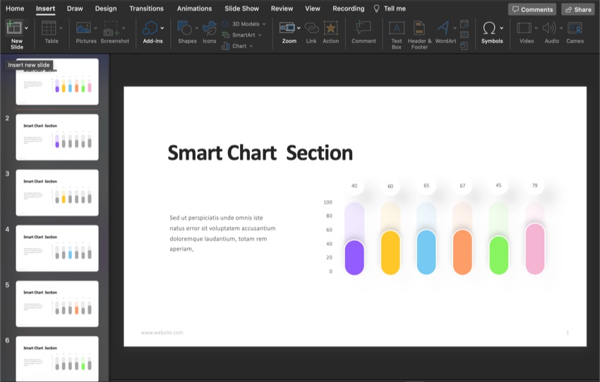
If you've got data in your presentation, charts can help the audience visualize it. There are many different charts and graphs that you can use to present your data. One of the charts is the radial bar chart.

In this article, we’ll cover what a radial bar chart is and how to create a radial bar chart from scratch.
What Is a Radial Bar Chart?
The Data Visualization Catalog states,
“A Radial Bar Chart is essentially a Bar Chart plotted on a polar coordinates system, rather than on a Cartesian one.”
So, a radial bar chart is a multilayered circle or doughnut chart. This chart originated from a classic bar chart and evolved into what it is now.
This chart can help you visualize data whether you're comparing sales, production, demographics, and more.
How to Create Radial Bar Chart
If you want the audience to be able to visualize your data, try using a radial bar chart. Here’s how to create a radial bar chart from scratch in PowerPoint:
1. Download a Template

This tutorial uses the Bar Chart Infographic PowerPoint Template from Envato Elements. This template has a bar graph on every slide. So, if you're creating a presentation with a lot of data, this template could work for you.
The template comes with both a light and dark background option. Also, with handmade infographics. But this template doesn’t have a radial bar graph, so we’ll have to create on.
2. Add a New Slide
On the left of your screen is a side panel with all the slides. First, you need to decide where you want the new slide to appear. Then, click in between the slides. A blinking orange bar appears when you click between the slides. Where that orange bar is where the new slide appears.
To add the new slide, click on the Insert tab. Next, in the toolbar, click on the New Slide button. A new slide is added where the orange bar is.
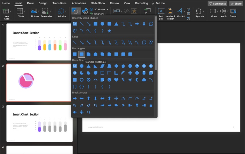
3. Add the Outer Circle
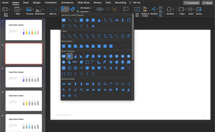
To create a radial bar chart you first need to create the outer body of the radial bar chart. To draw a circle, click on the Insert tab. Next, click on the Shapes button in the toolbar. A shapes menu appears.
Choose the Oval under the basic section. Your cursor becomes a drawing tool. Draw the circle where you want it to be.
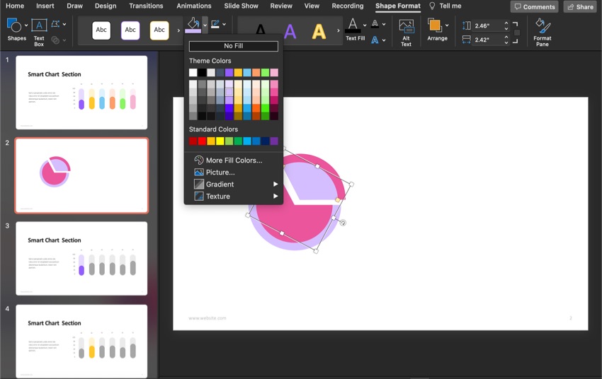
4. Change the Color
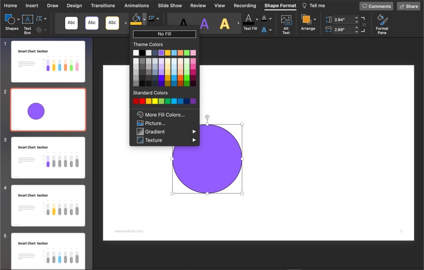
You can change the color of your radial graph. First, click on the shape so that it's selected. Once the shape is selected, a Shape Format tab appears. Click on that tab. Next, click on the arrow to the right of Shape Fill button in the toolbar. A color menu appears. Choose the color that you want.
5. Remove the Shape Border
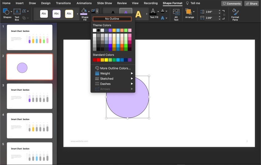
Let's remove the border to make your circle bar chart look professional and clean. First, make sure your shape is selected so that the Shape Format tab appears. Next to the Shape Fill button at the top is the Shape Outline button. Click on the arrow next to the button.
When you click on the arrow, a color menu drops down. From the color menu, click on the No Outline button. This removes the border around your circle.
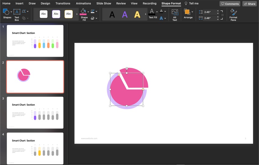
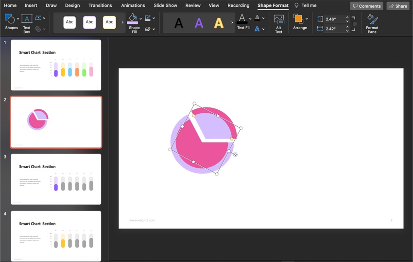
6. Edit the Shape
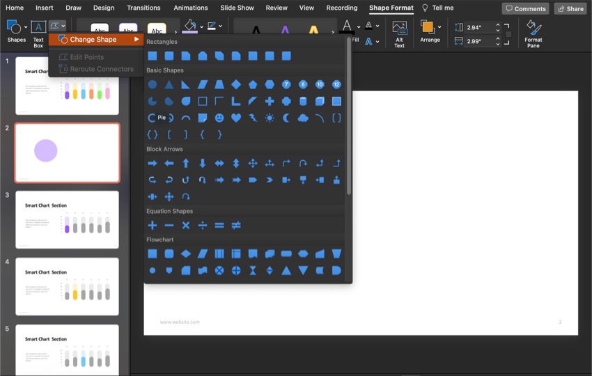
After selecting the radial graph, click the arrow to the right of the Edit Shape button in the toolbar. This causes a menu to drop down. From that menu, click on the Change Shape option. Next, click on the Pie option from the shape menu.
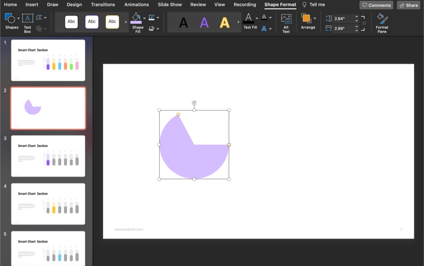
To change the outer part of the pie chart, drag the yellow handles until you get the shape you want.
7. Duplicate Your Outer Shape
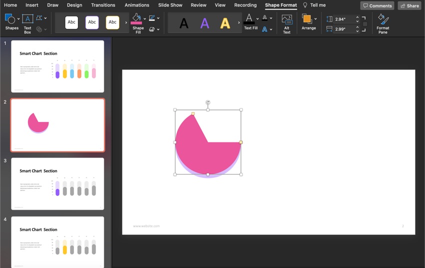
You can use two methods to copy the outer body of your radial graph.
- Use keyboard shortcuts. They're Control +C and Control + V for Windows, Command + C, and Command + V for Mac.
- Right-click on the radial graph, press Copy, then right-click again to paste. The duplicate is a part of your radial chart's outer body. After you’ve copied your pie chart, position the copy over the original pie chart. It should look like the same pie chart.
8. Rotate the Pie Chart
Next, rotate the duplicate pie chart. My pie chart is going to be a different color for this tutorial. To turn your pie chart, click the rounded arrow at the top.
9. Resize the Pie Chart Copy
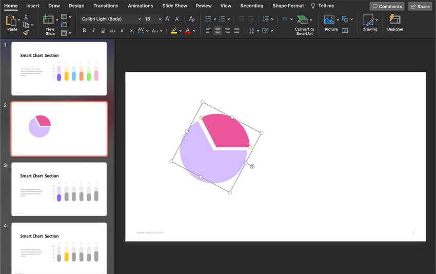
Separate the copied radial chart from the original. Next, use the yellow handles to resize the copied radial chart. Drag it so that copied radial chart looks like a piece of pie but with some space. The two charts should be parallel to each other.
10. Create the Inner Circle
For this step, you need to duplicate the first circle bar chart (the purple one). You can use either copying method that was talked about in step seven.
After you’ve duplicated first the circle bar chart, you want to make it slightly smaller than the original. The best way to ensure your circle bar chart looks good is to adjust it on top of the original.
11. Create the Second Inner Circle
Just like in the previous step, we need to create the inner part of the radial graphic. So, we need to duplicate the second outer circle (The pink one). After you’ve duplicated it, place it over the original and use the handles to make it a bit smaller. You may need to move all the pieces around a little until it looks right.
12. Change the Colors of Your Chart
The colors have already been changed to make it easier to see the changes in the tutorial. To change the colors of your radial bar chart, begin by clicking on the piece that you want to change the color of. It's best to do contrasting colors or colors that don’t look the same.
After you’ve clicked on the radial bar chart piece, a Shape Format tab appears. Click on it. Next, in the toolbar, click on the Shape Fill button.
From the color menu, choose the color that you want. Repeat this step until every piece is the color you want.
14. Add Data Labels
Now that you’ve made your radial bar chart, you need to label what the sections mean. In the shapes, there's a rounded rectangle that shape is used as the label.
To insert the rounded rectangle, click on the Insert tab. Next, click on the Shapes button. When you click on this button, a shapes menu appears under the rectangles section. Click on the rounded rectangle option.
After you click the rounded rectangle option, your cursor turns into a drawing tool. Draw the rectangle where you want your label.
15. Add Text to the Labels

To add text to your radial graphic labels, you need to add text boxes to the labels. To do this, click on the Insert tab. Next, in the toolbar, click on the Text Box button. When you click this button, your cursor turns into a drawing tool.
First, draw a text box inside the rounded rectangles that were created in the previous step. Once you’ve drawn the text box, click inside the textbox and start typing.
16. Connect the Labels to the Chart

To connect the radial bar chart labels, you’ll need to have a line connecting them.
To draw the line, click on the Insert tab. Next, click on the Shapes button. Next, choose the Line option under the Lines section from the drop-down menu.
Once you click on the Line option, your cursor will turn into a drawing tool. Next, draw your line connecting your label and chart. You may need to draw multiple lines to connect your chart and label.
17. Change the Line Color
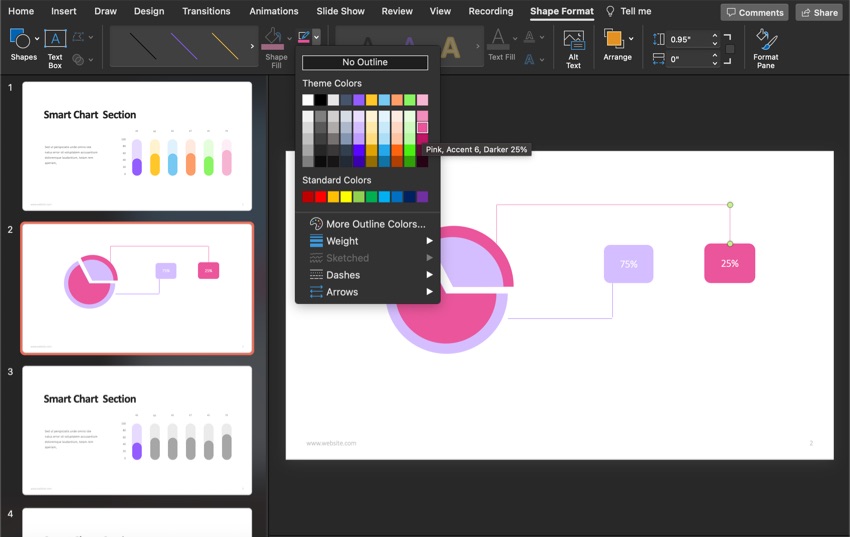
To change the line's color, click on the line next and click on the Shape Format tab. In the toolbar under this tab, click on the Shape Outline button. Choose the color that matches your radial diagram from the menu that drops down.
18. Change the Line Thickness
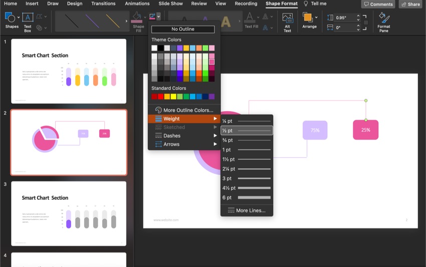
The default thickness for the lines is thin, so to make the visibility better, you should make the lines thicker.
First, click on the line that you want to change. Next, click on the Shape Format tab. Then, in the toolbar, click on the Shape Outline button. From the menu that drops down, choose the Weight option. Finally, choose the weight that you think works best.
19. Add Titles
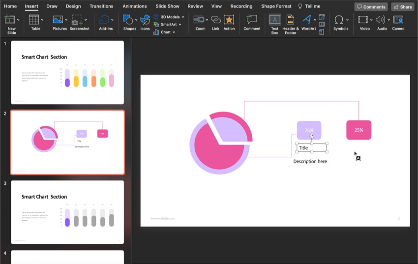
Under the labels, you’ll need to add titles and descriptions for your radial bar chart. To do this, click on the Insert tab. Next, in the toolbar, click on the Text Box button. Then, use your cursor to draw a text box under the labels.
The Best Source for Premium PowerPoint Templates
Envato Elements is the top source for premium PowerPoint templates. It's a subscription service with a low monthly fee and unlimited access to premium digital assets. Some of these digital assets include premium PowerPoint templates, images, fonts, graphics, and much more.
Professionals make each template to look impressive and stylish. This means that most of the work is done for you. All you need to do is add your text and images to the placeholders. So don't worry if you like to add your personal touch to your presentation, don’t worry. A good premium template is easily customizable.

Download a Premium PowerPoint Template Today!
Now that you know how to make a radial bar chart try making one in your next presentation where you've got to present data. If you want to save time from having to create a whole PowerPoint presentation, try using a premium template from Envato Elements.
 By
By


