

When it comes to creating a compelling and effective document, one of the most important tools at your disposal is the font (also known as "typeface").


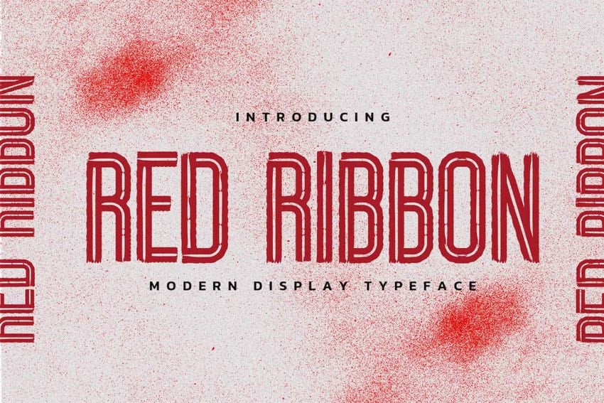
Learn how to add fonts to Microsoft Word from sources like Envato Elements. (Image source: Envato Elements)
Fonts do much more than improve—or hamper—the legibility of your piece. They set a tone. They've got personalities. They evoke feelings. As such, fonts can either reinforce or undermine your brand.
Because fonts are so important, you may want to change the default fonts in Microsoft Word. In this article, you'll see, step-by-step how to add fonts to Microsoft Word so you can change the default fonts in your document.
You’ll also learn tips on where to find the best Microsoft Word fonts and how to choose the best ones for your document.
Jump to content in this section:
- Why Use Premium Fonts in Your Microsoft Word Document?
- How to Change Microsoft Word Default Font
- How to Add Fonts to Microsoft Word
- 2 Types of Fonts
- 5 Tips on Using Typography Effectively in Your Word Documents
- 5 Best Font Styles for 2025
- Find the Best Premium Fonts for Your Microsoft Word Document
- Put Fonts to Work in Your Microsoft Word Document Today
Why Use Premium Fonts in Your Microsoft Word Document?
When it comes to creating documents that get and keep your readers’ attention, fonts are some of your most powerful tools. The right fonts:
- Reinforce your branding.
- Express the right tone.
- Direct the reader’s attention.
- Improve readability.
You might be tempted to use free fonts for Microsoft Word in your next document. But remember, those built-in MS Word fonts are exactly the same fonts that everyone else is using. Or you might find a free Microsoft Word fonts download. But free fonts are often not as well-designed as premium fonts.
How to Change Microsoft Word Default Font
Word comes with default fonts, but you can change the font to match your branding or to change the tone and personality of the document.
You’ll find that dozens of fonts are already built into Word, and you can replace the default fonts with those. And you can also add new fonts. We’ll talk about how to add fonts to Microsoft Word later in this post.
To change the Microsoft Word default font, you've got three options:
1. Change the Microsoft Word Default Font for a Block of Text
This is a quick method that’s good to use if you want to change the default font only for one or a few bits of text. Here are the steps:
Step 1. Select the Text


Step 2. Open the Font Selection Tool


Click on the Font selection tool on the ribbon. You must be on the Home tab to see the buttons for formatting text. The Microsoft Word fonts list opens.
Step 3. Find the Font You Want to Use
The Microsoft Word fonts list shows the Theme Fonts, Recent Fonts, and All Fonts. Scroll down farther to see all the fonts available on your computer. This includes fonts that are built-in as well as fonts you've added, listed in alphabetical order. The fonts list also gives you a preview of what each font looks like.
Click on the font you wish to use. A triangle next to the font means there are further selections you can make.


Step 4. Change the Font Size
Go to the font-size button to change the font size.


Or click the Increase Font Size or Decrease Font Size buttons to change the font size by increments.
Step 5. Change Other Text and Paragraph Settings
Use the other buttons on the ribbon to add emphasis (bold, italics, underline), change the font color, and apply other effects.


We've now changed the default font in Microsoft Word.


2. Replace the Default Font Based on Paragraph Style
By changing the font used for a paragraph style, the change is applied globally in your document for all text with that paragraph style. Use this if you want to change the default font for large sections of text.
Follow the steps on how to change the Microsoft Word default font for a paragraph style:
Step 1. Select the Text
Highlight text that’s representative of the paragraph style you want to re-format. Make sure it's got the paragraph style you want to change.


In this example, I'll replace the default font for the Normal paragraph style.
Step 2. Apply the Font Settings You Want to Use
Follow the steps in Method 1 to change the font, font size, font color, and apply other settings. You may also want to change the paragraph settings, such as alignment, line spacing, etc.


Step 3. Apply the New Formatting to the Paragraph Style
With the cursor in the paragraph you’ve formatted, click on the Styles button on the ribbon. This opens the paragraph Styles selection.


The current paragraph style will be highlighted. In this case, it’s the Normal style. Right-click on the Normal style, then click on Update Normal to Match Selection.


All other paragraphs with the Normal style are updated with the new font and settings you made.


3. Change the Font Based on Paragraph Styles Button
This method has the same end-result as Method 2. It changes the default font for a specific paragraph style. The steps are slightly different, as you'll see:
Step 1. Open the Styles Settings
Click on the Styles button on the ribbon. This displays the paragraph styles.


Step 2. Modify the Paragraph Style
Right-click on the style you wish to change. Click Modify...


The Modify Style dialog opens.


Change the font, font size, and other settings. The box shows a preview of what the paragraph will look like when the settings you chose are applied. If you’re happy with the way it looks, click OK.


The new font (and other settings) will be applied to all paragraphs with that paragraph style.
How to Add Fonts to Microsoft Word
Right out of the box, Microsoft Word comes with dozens of fonts built in. But what if you want to use a font and you don’t see it on the Microsoft Word fonts list?
In that case, you add the font to Microsoft Word. I’ll walk you through how to do that in this section:
Step 1. Find New Fonts
The first step is to find the font you want to use. There are many sources of custom fonts. One to consider is Envato Elements, where you can download an unlimited number of fonts for one small subscription price.
To find a font you like, log into your Envato Elements account.


On the search bar, click on the downward arrow, then select Fonts.


Type a keyword into the search bar, depending on what kind of font you’re looking for. Click the search icon. The most relevant results appear.


Refine the results by Categories, Spacing, Optimum Size, and Properties. You can also sort the results by popularity (Popular) and newness (New).
Click on a font image or name to see its details.


When you find a font you like, click on any of the Download buttons on the page.


The Add this file to a project dialog box pops up.


Select a project to add the font file to. Or click Create new project to add it to a new project. For this example, I'll add the font to my existing tutorial project. Click the Add & Download button.
The file manager opens (Finder, if you’re on macOS; File Explorer, if you’re on Windows). Specify where you want to save the font file on your computer. Click Save.


The font files are now saved on your computer as a zip file.


Double-click on the zip file to unzip it.


Double-click on the font file itself to open it. It'll usually have an extension like OTF or TTF. Click Install Font.


This adds the font to your computer’s fonts library.


The new font should now appear in the All Fonts list in Microsoft Word. To confirm, click on the Fonts button on the ribbon and scroll down the list until you see the new font. If you don’t see it, you may have to restart your computer.


Now, follow any of the methods above to change the default font with the new one.
2 Types of Fonts
Now that you know how to add fonts to Microsoft Word and replace the default fonts in your document, it would help for you to know more about fonts. This will help you choose the best fonts for your Word document.
There are two basic types of fonts you can use in your documents:
1. Serif Fonts
Serif fonts have little lines at the end of each stroke, like this:


Common examples of serif fonts include:


Various research studies have shown that, when it comes to printed matter, serif fonts are the easiest to read and result in the best comprehension.
2. Sans Serif Fonts
As the name implies, sans serif fonts don't have little lines at the end of each stroke (“sans” means “without” in French):


These are some of the most common sans serif fonts:


Citing research by the Software Usability Research Laboratory, Drew E. Whitman in his book Ca$vertising, noted that sans serif fonts are the most legible fonts to use on a computer screen. Specifically, Arial, Courier, and Verdana were considered the best for online reading.
But these studies were conducted when the resolution of online screens was still very low (below 100 dpi) compared to printed materials (300 dpi). As computer screen resolutions get closer to 300 dpi, serif fonts may prove to be legible both online and offline.
In the meantime, you can use both serif and sans serif fonts in one document—if you know how. Read on for tips on how to use combine fonts.
5 Tips on Using Typography Effectively in Your Word Documents
It’s easy to get carried away with fonts! You may find that having so many kinds of fonts available at your fingertips unleashes your creativity. Yet, as with most things, fonts can either enhance or sabotage your document.
Follow these tips to harness the power of typography:
1. Keep It Simple


When it comes to choosing fonts, legibility is of utmost importance. Sure, it’s easier than ever now for you to find the most creative and outrageous fonts. But if nobody can read your text, then they defeat their purpose. If you must use an ornate font, restrict it to one letter or word.
2. Stick to Two Fonts
A document that’s dripping with many different fonts makes it look amateurish, confusing, and incoherent. For best results, stick to a maximum of two fonts: one serif and one sans serif. (More on this in tip #4).
Remember, use formatting like bold, italics, underlines, different font sizes and colors to add emphasis and variety.
3. Match the Tone and Goals for the Document
Fonts have personality, so pick the ones that match the tone and goals of the document. For example, the fonts for a 16th birthday party invitation will be different from the ones in a financial business report.
When in doubt, pre-test the document. Show it to other people, especially those who are like the intended audience. Make sure they can comprehend the document, first, and that they respond favorably.
4. Choose Fonts Appropriate for the Document’s Intended Use
Whether the document will be printed out or consumed on a computer screen will also affect your choice of fonts.
If you’re making a printed document, use the sans serif font for headings and the serif font for body text. For a web-based document, switch it: Use a serif font for headings and sans serif for body text.
5. Use Handwritten, Cursive, and Decorative Fonts Sparingly


There are other font types that may not fit easily in either serif or sans serif categories. These include handwritten, cursive, and decorative fonts. Handwritten fonts, as the name says, look like they were written by hand. These are extremely popular and useful for adding a warm, personal touch on materials. They can range from casual to glamorous.
Cursive fonts are a kind of handwritten font that look like they’re written in longhand. Beware of using cursive and handwritten fonts because they can be difficult to read. Use them for short bits of text you want to emphasize.
You can easily find handwritten fonts in marketplaces like Envato Elements.
Decorative fonts have special effects or treatments. They may be serif or sans serif. And some handwritten fonts can be considered decorative as well.
Here’s a sampling of the decorative fonts available in Envato Elements:
5 Best Font Styles for 2025
Designers come up with new fonts every day. Below are five of the best and freshest Microsoft Word font styles we’re seeing for 2025, along with two fresh examples of each style:
1. Vintage Fonts
Vintage fonts evoke the aesthetic of times past. If you’re working on a document that’s about a specific time, you’re bound to find a font to match.
Anthique - Vintage Typeface


Anthique is reminiscent of handmade Victorian hand lettering but with a modern flavor. It works best for materials that relate to the early 1800s. The font includes three variations in TTF and OTF formats. It also supports multilingual characters.
Middle Class Script


Middle Class is a script font that’s evocative of the bold style of the '60s and '70s. It's got a hand-drawn and layered style, and includes punctuation, common ligatures, and extra swashes (lines).
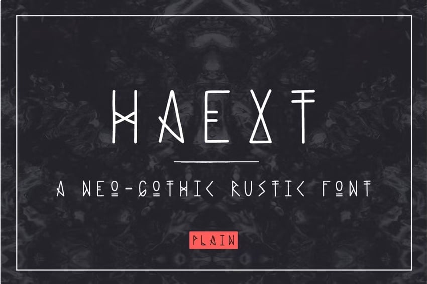
2. Mall Goth Fonts


Mall goth fonts were popular in the late 90s and are returning thanks to a social media trend. You can tell what this font is by its sharp edges, smoky forms, all-black compositions, and accompanying graphics, such as barbed wire, chains, and skulls. You can use this font to add an edge to your project.
3. Psychedelic Minimalist


Psychedelic minimalist fonts have a 60’s feel, is heavily stylized, and have a minimalist look. It also has a warped and altered look giving it a psychedelic look. Typically, this font type is used in advertising or for the service industry. It wouldn't suit serious projects because of its whimsical look.


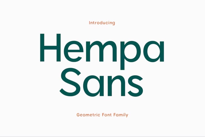
4. Geometric Sans Serif
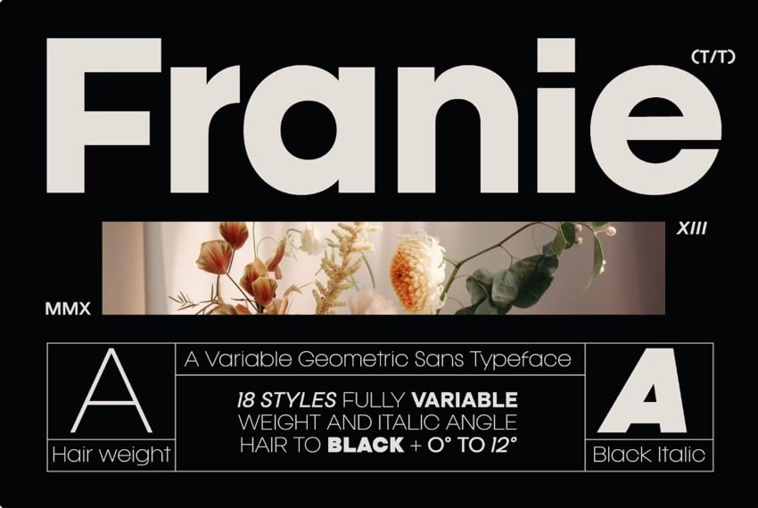
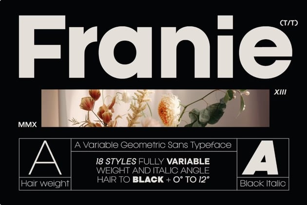

Geometric sans serif fonts are reliable and have a good balance of structure and visual appeal. This font works well for logos, fun projects, and serious projects. It's versatile because it's easy to read and has a clean look.
5. Bright Red


A font is typically black, so it's been trending to make your words stand out with a red font. However, using this font sparingly is best because it could overwhelm the viewer. The point is to draw attention to a specific word or phrase.

Find the Best Premium Fonts for Your Microsoft Word Document
You can easily add fonts to Microsoft Word from outstanding sources like Envato Elements. To be able to download unlimited fonts, then look to Envato Elements. You get access to thousands of fonts. Download as many as you need for one small subscription price.


Put Fonts to Work in Your Microsoft Word Document Today
As you’ve learned in this article, you don’t need to stick to the default fonts in Microsoft Word. Follow the steps outlined above to replace the default fonts with ones that are more appropriate to your document.
Now that you understand how to add fonts to Microsoft Word, you're ready to start taking advantage of the unique look a professionally designed font can give your documents.
At Envato Elements we've got some of the best Microsoft Word fonts available. Download your favorites for your next MS Word document.
Editorial Note: This post was originally published in February of 2020. It's been reviewed for accuracy and relevancy by Sarah Joy.
 By
By


