

If you do any project management, you’ll eventually need to create a Gantt chart.
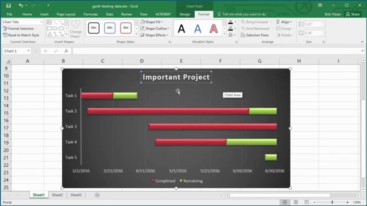
A good Gantt chart illustrates the lifecycle of individual tasks that make up a project. If you build a house, for example, a Gantt chart can illustrate the time it takes to procure the site, get permits, buy materials, hire workers, connect utilities and so on. There are also relationships involved: you can’t start work without permits or have workers show up before materials arrive. A Gantt chart will also tell you how much of each task is complete and how much left there is to do.
In this tutorial, I’ll show you how to make a Gantt chart by formatting a bar chart based on simple data. We’ll start by entering a task name, the date the task will start, how many days of each task have been completed and how many days are still left to go. We also need to know the start and end dates, but putting those on the worksheet is optional.
Screencast
If you want to follow along with this tutorial using your own Excel file, you can do so. Or if you prefer, download the Zip file included for this tutorial, which contains Excel spreadsheets to work with. Watch the complete tutorial screencast above or work through the step-by-step written version below.
1. Input Initial Data in Excel
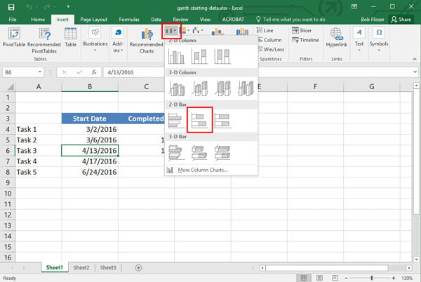
Input the data as follows (or start with the download file "gantt-starting-data.xlsx"):


2. Add a Chart
Now click anywhere inside the data area. Then go to the Insert tab on the ribbon bar, and in the Charts section, click the first, Chart button. Choose the 2D Stacked Bar.

2. Style the Chart
Step 1
Stretch the chart out to see it better, then apply a built-in design. Keep the chart selected, go to the Design tab on the Ribbon bar, and in the Chart Styles section, click the Down arrow to display all the choices.
Step 2
In this example, I chose Style 8:


Step 3
Most of the bars show three sections: the length of time before the project starts, the days completed, and the days remaining.


Step 4
We need to hide the first section of each bar, because the length of time before the project starts is meaningless. So click any of the first sections and select the Format tab on the ribbon. There are three items to adjust in this tab.
Click the Fill drop-down and select No Fill.


Step 5
Keep the bar selected. Click the Shape Outline button, and choose No Outline.


Step 6
Finally, Click the Shadow section on the left, and from the Shape Effects drop-down, click Shadow and choose No Shadow from the flyout.


Click the chart background to deselect the bars and get a better look.
3. Fix the Dates
Step 1
Now let’s fix the range of dates along the bottom. Click any of the dates. The tooltip should tell you it’s the Horizontal (Value) Axis.


Step 2
With the Format tab of the ribbon still active, click Format Selection on the left to display a task pane of options. We want to set the start date as the first date in the list: March 2, 2016 and the end date as July 1, 2016.
In the task pane, you’ll see the Minimum and Maximum dates showing their 5-digit serial numbers, but you can enter dates with standard, short notation. So set Minimum to 3/2/2016, press the Tab key, then set Maximum to 7/1/2016 and press the Tab key. The boxes will change the dates to their serial numbers, but you’ll see the chart adjust to the dates you entered, with Task 1 shifting to the start of the horizontal axis.


4. Rework Task Ordering
Step 1
Now let’s reverse the list of tasks in the vertical axis so that Task 1 is on top. Click one of the task names and the tooltip should tell you it’s the Vertical (Category) Axis. Again click Format Selection on the ribbon. In the task pane, check the box for Categories in reverse order.


Step 2
Notice that puts the horizontal axis on top of the chart. If you want it back on the bottom, there’s a quick fix: once again, click one of the dates on the horizontal axis, and click Format Selection on the ribbon.
If necessary, scroll down the Format Axis task pane and click the small triangle to the left of Labels to display its options. Click the Label Position drop-down and choose High.


Click the X at the top of the task pane to close it.
5. Remove Unwanted Fields
The last thing we want to do to the chart is remove “Start Date” from the legend. Click the legend to select it, then click Start Date to sub-select it.


Press the Delete key on your keyboard to delete it. Notice the other two items in the legend adjust their position automatically.
6. Name Your Finished Gantt Chart
One last thing: give your chart a meaningful title. Just click in the placeholder “Chart Title” on top to select it, then click it again to insert a text cursor. Now edit the name. Press the Esc key twice to exit editing the name and deselect the chart.
Congratulations! You now have a completed Gantt chart.


7. Bonus Formula
But one more thing: what if you need to create a relationship between the end of Task 1 and the beginning of Task 2? Maybe there should be a 2-day gap between them or a 5-day overlap. For that, we’ll put a formula in the data.
Select B5 and delete. To create a 2-day gap from the end of Task 1, enter the formula:
=B4+C4+D4+2
If you want a 5-day overlap, enter this formula, instead:
=B4+C4+D4-5
Now put it to work: for Task 1, change the start date (B4), or the days completed (C4) or the days remaining (D4). As soon as you do, the bar for Task 2 will adjust automatically with respect to the bar for Task 1.
To play with the completed exercise, or to use it for your own projects, download the free Excel project Zip file.
 By
By


