

Pivot tables are often a fan favorite for spreadsheet users in Microsoft Excel or Google Sheets. Spreadsheets are a great tool for capturing and storing data. But, they can quickly grow to the extent that it's hard to find meaning or insight in them. That's where pivot tables come into play.
I've always loved Apple Numbers for its simplicity and interface, but it lacked any feature that helped me sort through large datasets. Without pivot tables, spreadsheets in Numbers were just walls of data. Up until recently, there were no pivot tables in Numbers.
But when Apple released the latest update to their spreadsheet app, Numbers, I couldn't help but notice that they had slipped in a feature that sounded a lot like a Numbers pivot table. In Apple Numbers 5.2, a new feature called smart categories was added that can bring some sanity to your data. We'll build out something similar to a pivot table in Numbers.
Before we get started in this tutorial, make sure that you're running the latest version of Numbers. Check your Numbers version by opening the app and going to Numbers > About Numbers. Make sure that you're using at least version 5.2 You can always open the App Store for macOS and check for updates if you need to catch up with the latest release.

Watch & Learn
Categories feel a lot like pivot tables in Numbers, and this is a brand-new feature. I've put together a screencast that can help you see the power of the organizing data. Check it out below to get more familiar with this brand new Organize feature.
Still want to learn more? Keep reading the tutorial below to see an illustrated guide on how to organize data and summarize it with the Organize option.
Download Sample Data
It helps to have sample data that you can use to follow along with a tutorial. That's why I've prepared a Numbers workbook that includes enough data to help you get started with this new Categories feature. Download the data at this link. You can use this data to create pivot tables in Numbers.
Learn more about the basics of Numbers and how to work with data in the tutorial below that'll help you get comfortable with Formulas in the app:

Why Organize Your Data in a Spreadsheet?
First, it helps to understand why organizing your data is so helpful in a spreadsheet. Let's start with a screenshot of the data I included with this tutorial. Each row in the data is a separate record of a transaction.

Sure, you can see the individual rows and records in this data. But how do you find meaning in it or summarize the data, finding total amounts?
Using the Smart Categories feature in Numbers can help you answer all of the following questions (and more) about the sample data:
- Which states have the highest amount of sales?
- Who are our top customers?
- Which business unit made the most sales?
Simply put, this new feature can help you summarize and understand your data. The problem isn't that we don't have enough data, it's that 100 rows of data are hard to summarize. The answer is to use pivot tables in Numbers, or the Smart Categories feature as Apple calls it.
In the old world, you'd be filtering, subtotaling, and making separate calculations (or jumping over to Excel with the data) to answer these questions. That all changed when Apple added Smart Categories, which can help you understand your data.
How to Use Smart Categories in Numbers
Now that you've learned why Smart Categories and organizing your data is so helpful, let's walk through an example.
With the table selected, click on the Organize button in the upper right corner of Numbers. Now, you'll see a new panel with several options for working with your data.
In Numbers 5.2, three options show when you click on the Organize button. Two of them have been in Numbers for some time, and Categories is the new addition. Here's what each option brings to the table:
- Categories. As you've already found out, categories can help you group up your data. We'll walk through several examples in this tutorial, so read on to find out more.
-
Sort. Sorting data doesn't necessarily answer any questions about it, but it does put it in a sequence. That could be alphabetical, or chronological (such as sorting data based on the date.)
- Filter. Filtering doesn't change the original data either, it merely shows and hides based on the filter criteria you specify.
Let's walk through an example of using Categories, or pivot tables in Numbers, to summarize a spreadsheet in Numbers.
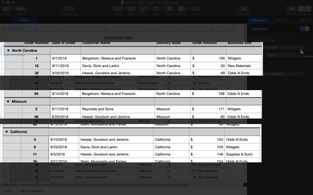
To start working with this feature, click on a data table, and then click on the Organize button in the upper right corner of the app. Then, choose the Add a Category dropdown, and start by selecting a field in the dataset that you want to organize your data by. In the first example, let's choose Delivery State to group the data by the state for the order.

Now, your data is grouped and organized based on the criteria you chose. Notice in the screenshot below that the table is now consolidated into the states, with all rows that match the criteria under it. See the screenshot below for example.

These are the basics of how to organize your data in Apple Numbers. Just choose the category, and you'll see the data come together in an organized way.
Earlier, I posed three data questions that the Smart Categories feature can help us answer. Now, let's walk through hands-on examples to answer those four questions with the sample data.
1. Which States Have the Highest Amount of Sales?
So, we've already started by organizing the data by state. But, we still need to sum up the amounts by state.
In the Order Amount column, click on the Gear icon, and then choose Subtotal. This will subtotal up the amounts by state.
Now, you just need to roll things up by state. Right click on the first state in the list, and then choose Collapse Peer Groups. This collapses everything down to a state level for easy summary and review.

Now, I'm going to just right click on the Subtotal header column, and choose "Sort Order Amount" Summaries Descending.

That's it! Now you'll see the states sorted by the order amounts. Quickly, you can hone in and understand the business far better because of the ability to summarize the data.
2. Who Are the Top Customers?
Now, we can create a similar summary to study who our top customers are. Instead of grouping by state, this time we'll group by the customer in the order data.
All that you need to do is change the Categories drop-down from Delivery State to Customer Name. With just a couple of clicks, the data flip to being organized and arranged by the customer instead of the state.
Then, just repeat the steps by right clicking on customer name and choose Collapse Peer Groups.

Want to try one other way of viewing the data? Instead of seeing the subtotal by customer, study the customer by which one, on average, places the largest order.

That's it! We re-used our setup from the first example in this tutorial and simply flipped it to focus on the customer instead of the state of delivery.
3. Which Business Unit Made the Most Sales?
Again, this example will look very similar to the two before it. We've got a business unit column in the data source, and let's simply change the dropdown to Business Unit instead. Now, the data results will roll up by the business unit.
Now, let's dive a bit deeper and add two levels to the data. On the right side, click on the Add a Category again, and this time, choose the Customer Name. Now, notice that you can see not only a summary at the business unit level, but at the customer level as well.

That's it! You can add multiple layers to your data organization and summarization.
Keep Learning
In this tutorial, you learned how to take data and organize and understand it in Apple Numbers. Spreadsheets aren't just a way to capture data, but rather can serve as an analysis tool to understand that data.
Learn more about how Numbers, and how other apps approach summarizing data, with the additional tutorials below:
 Getting Started With Numbers for iCloud
 How to Use PivotTables to Analyze Your Excel Data
 How to Use Pivot Tables in Google Sheets (Ultimate Guide)
Have you tried this new feature that's like a Numbers pivot table? Let me know in the comments below if you've found a feature or technique that I've not discovered yet.
 By
By


