

A great annual report layout design can really help take your content further. The best annual report design layouts are both visually interesting and easy to navigate.


In this article, we'll look at what makes a good annual report design via design principles that anyone can use. We'll also explore some of the best annual report design templates available.
What Makes a Great Annual Report Layout Design?
Design can often seem limitless. There's so many things we could do with a layout design. You could push towards a modern aesthetic or a minimalist aesthetic. You could do something traditional or something unexpected.
It's easy to get so wrapped up in aesthetics that we forget that design does have a method. It's not all about looks, and it's certainly not something left to luck.
Instead, we've got formulas we can use to create a good annual report design time and time again: the Principles of Design. Think of them as the building blocks of any design, regardless of the type.
Let's take a closer look at the Principles of Design. Learn how you can apply them in your annual report design process. Use these as important annual report design tips whether you're building a design from scratch or working with a template:
1. Hierarchy


In design, think about hierarchy as a visual system of importance. If all the information on the page was the same—like the same size and the same color—nothing would stand out.
For example, it would be hard to tell the title from the body copy if they were both the same size, same color, and same font. Differentiating between the two helps establish that one has visual importance over the other. It means that we're supposed to read the title first.
Check out the annual report design layout above. In this case, the headline "How We Work" is at the top of the composition and it's larger than the body copy. Some parts of the body copy are bolder and larger. This makes them more predominant than many of the smaller snippets of body copy. This is an example of Hierarchy at work.
2. Repetition


Repetition might sound boring, but it's actually a really important Principle of Design. When something repeats, it starts to blend in. We stop noticing the singular, and the repetitive trait becomes more of a continuous observation.
Think about this visually. Something like a repeated header doesn't command our attention. Instead, it becomes an ambient part of the composition.
Look at the annual report design above. Notice that there's a running header across the top of most pages. It's small and supplemental, but it's also consistent.
So, the running header isn't a stand-out element—but it's a consistent wayfinding element that the user can rely on. This means finding things like page numbers will be easy. A few pages in and our eyes would know exactly where to look.
3. Imagery


The best annual report design examples are illustrated with images. Why is this the case? Because images break up monotony and deliver sleek styling to your document. You’ve likely heard it said that pictures are worth a thousand words. That fact remains true in the case of annual report layout design.
By adding photos to your annual report, you can help it stand out. Even focused readers may get bored if your reports are imageless and wordy. Photos add visual interest. And they serve more practical purposes too. Imagine that you’re introducing your leadership team in your annual report ideas. Add professional headshots so readers can put faces with names. Opened a new location? Share photos of it!
Images, in essence, are both practical and stylish. Consider the example above. As you can see, it's filled with images on each page. Notice how it presents a bright, attractive appearance. This is much harder to achieve without the use of imagery.
4. Variety


In some regards, Variety is the opposite of Repetition. Instead of repeating, Variety is all about mixing things up to create interest.
This balance between Variety and Repetition is important. One is designed to take a supplemental role. The other is designed to stand out and command attention.
If everything blended in, looked the same, and was repetitive, the composition would be boring.
If everything were wildly different, we'd risk a chaotic composition where there's no consistency.
Take a look at this design example above. We've got some repeating elements here, like the yellow bar at the bottom. This helps make the pages look related. But we also have varied elements that break up the designs and keep the pages interesting. They share similarities, but they've got their own unique differences too.
5. Contrast


When we're talking about value—lightness and darkness—we're often referring to Contrast. To explain, let's take a look at the sample design above.
The word "Annual" has high Contrast here. Notice how it really stands out against the white background. That's because this navy blue is a dark value. When you've got a dark value against a light value, the result has a lot of Contrast. This makes it stand out.
"Report" blends in a lot more with the background. Why is that? Well, it's low Contrast. This is because its value is closer to that of the background color.
The more contrast a design element has, the more it typically stands out and commands attention.
6. Balance


Balance often refers to weight in a composition. For example, a layout can have symmetrical or asymmetrical balance. We can use this to our advantage to help lead our viewer's eyes through the composition.
In the above design example, where do you see the bulk of the "weight" in this composition? Notice how we've got dark color and a high concentration of type at the bottom. It's pretty "heavy" down there. The upper part of the composition has a lot of open, negative space.
This arrangement puts a lot of emphasis down on the bottom of the page.
7. Proportion


Proportion refers to two different things. The first is scale, or how big or small something is in your composition. So, for example, the "45%" in this composition is rather large.
Proximity plays a large role in Proportion. The "45%" wouldn't feel large if it wasn't set next to smaller design elements. Proximity isn't simply scale. It's also distance and ratio.
The important takeaway here is that the size of your design elements matters, and it matters in relation to the rest of the design.
8. Emphasis


Emphasis is one of the most complicated Principles of Design, because it needs the other principles to exist. Think of Emphasis as your focal point. We create Emphasis by using the other Principles of Design effectively.
Emphasis is created by Variety. Remember, we already discussed that things that repeat tend to not be very noticeable. Annual report design inspiration should include higher variety. Things that are low in contrast just don't stand out.
Take a look at the example design above. Where's the first place your eyes go, when you look at this layout design? Chances are "Our Services" is one of the first places you look. Let's look at why:
- The font itself is large and at the top of the layout. That's Proportion in action.
- This type is also rather dark on a light background. The Contrast is high, which makes it stand out.
- Several parts of the design here are quite uniform. This type is not. Because it's different, it stands out.
Similarly, the imagery on the right also has some Emphasis, to a degree. Hierarchy isn't all or nothing. You can have levels of visual importance.
9. Movement


Let's talk about Movement. Whether we realize it or not, our eyes navigate through the page when we read or observe a layout design. As designers, we've got the ability to influence this navigation.
We can imply Movement in many ways. In the design example above, we've got a literal line guiding us through a timeline. It implies movement across the page, from left to right.
Think of other things that might apply to your target audience too. For example, what direction would feel most natural for reading in the applicable language? We can play into these preconceived preferences.
10. Clarity


As you seek annual report design inspiration, remember your goal. You’re communicating key annual results to your stakeholders. As such, it’s crucial to be as clear as possible. You need to be sure that readers understand and recall the exact message you are trying to deliver.
Clarity as a concept means presenting information in the best possible way. So often, this means illustrating data with visuals. Columns or paragraphs of numbers seldom lend clarity. In fact, they can confuse or even mislead an audience.
Explore the annual report design examples above. They feature infographics. These are powerful illustrations used to share data. Annual report ideas are presentable through infographics. At a glance, readers can grasp even complex ideas that you are sharing.
These are an excellent way to bring your annual report to life. By adding clarity, you can inspire readers as they learn about your journey of the prior year.
Find the Best Annual Report Design Templates on Envato Elements
A lot goes into a great design, right? There are so many different things we can consider.

This is one reason why starting off with a professionally designed annual report layout design template can be really handy. It can help jump-start your design process, as these templates are fully customizable. Or if you're in a rush, use a template to finish your project in a snap. Understanding some design theory can help you choose just the right template.
The problem is: professional design assets can be really pricey.
This is why Envato Elements is worth checking out. For one, low fee, you get access to a whole library of professional design assets. This includes hundreds of annual report design templates that you can download, all without any extra charges.


That's the beauty of unlimited downloads. If you're a creative professional and you regularly find yourself needing assets to complete your projects, this can add up quickly. On Envato Elements, download fonts, stock photos, graphics, templates, mockups, and more, all without worrying about the cost adding up. It's a great bargain.
Let's look at a few of the inspiring annual report design templates over on Envato Elements that you can download today:
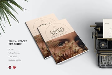
1. Geometric Annual Report Layout Design Template


Isn't this design stylish? There's a lot of fun geometry on the cover and throughout the layout designs too. Swap images, change the colors, and fully customize this template in any way you like.
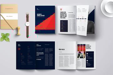
2. Branding and Creative Agency Company Profile


With colorful graphics, this is an annual report layout design any firm can use. It includes two dozen pages in an array of styles. The grid structure makes the pages clear and easy to read.
3. Stylish Annual Report Design Template


Here's another stylish annual report layout design template. It includes 28 different pages that you can mix, match, and remix to your heart's content. Choose from two different dimensions too.
4. Square Annual Report


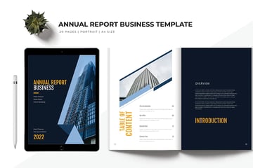
Find all your annual report design ideas here. This template is built in a unique square style! The 20 pages each give you annual report design inspiration. Inside, you’ll find twenty pages to work with, helping you share your content easily.
5. Clean Annual Report Layout Design Template


If you like a clean, sleek aesthetic, give this template a look. It has annual report design inspiration on each page. There are ten pages included, but remember, you can change these pages in any way you like. It could be the perfect fit for many different projects.
How to Use Annual Report Layout Design Ideas to Inspire Your Work
Let's take some of the annual report design tips we discussed earlier and expand on them in a practical example.
We'll use this annual report layout design as an example. It's an Adobe InDesign template. We'll open it in the software to make some adjustments to the layout design.
Download it and work along with the walkthrough if you'd like to follow along with the annual report design process. Otherwise, you're welcome to use any design you prefer. These concepts will transfer.


Let's get started:
1. Consider the Flow of Your Layout
Think about where your eyes move in the composition. We discussed Movement—it doesn't always have to be as blatant as a drawn line.
For example, in this case, many would likely start on the left. There's two columns here. This flows differently than the layout on the right, which only has one column.
Notice how the different columns influences the flow of the layout on each page.
In this case, we're in Adobe InDesign. Open up your Pages panel by going to Window > Pages. Then, freely navigate through your layouts.


2. What Parts of Your Layout Should Be a Supplement?
Remember, your design should have supplementary elements. Some things should stand out and other things should play a lesser role.
For example, the body copy is often best set at a smaller size that things like headlines and subheaders. We see this in action, in this composition. We can also use color in this way too.
To change the color of your text in InDesign, turn to your Tools panel. Click on the small "T" under the Stroke and Fill Color to activate " Formatting affects Text". Then, with your text selected, click on the Fill Color to choose a new color for your text.


3. Where Can You Use Variety to Promote Emphasis?
Remember, having a focal point is important. In this example, one of the two-page spreads has been simplified.
Notice how we can create Emphasis by making the word "Welcome" larger than the rest of the design elements on the page. It's also a vibrant color that stands out and the font choice is different. These are all things that vary from the rest of the composition. That's what gives it so much Emphasis.
In Adobe InDesign, use the Type tool to edit your text. Change its size, the font, and other attributes with the Characters panel. Open it up by going to Window > Type & Tables > Character.


4. Is It Easy to Navigate Your Layout Designs?
Make sure it's easy to read and find content in your layout. Are the columns aligned in a way that's uniform and makes for a comfortable reading experience? Do visual additions to the layout complement or compete?
It's easy to get excited about design, but a successful design is about both form and function. If it looks pretty but it doesn't work well, then the design isn't a success. Take some time to test out your design, and don't be afraid to ask others to preview your work too.
Delete unwanted design elements in Adobe InDesign by selecting them with your Selection tool, and then pressing Backspace on your keyboard.


5. Does Your Layout Have Enough Breathing Room?
In this example, the layout has been edited to make room for more negative space. The term "negative space" refers to "empty" parts of the composition.
Think of it like any other space. We need room to breathe! You wouldn't want to pack your home from wall to wall. Your layout design is similar. This extra space can prove to be just as strong of an addition as any other part of your composition.
To resize elements in Adobe InDesign, select them with the Selection tool. Then, use the visible resize handles to click and drag and resize. This is especially useful for frames with a Fill Color, like in the example below.


5 Quick Annual Report Design Tips and Tricks
The more you practice working with design principles, the more natural it'll feel to use them in your design work. But there are some general tips and tricks of the trade you can keep up your sleeve for quick and effective results:
1. Less Is Often More


Good annual report design isn't about quantity. Avoid packing your layout designs with too much content. Instead, focus on things like organization, emphasis, and hierarchy. Too many extras makes for a chaotic layout, not an impressive one.
2. Stick to One to Two Fonts
This is another case of less is more. Choose one to two fonts and stick with them throughout your annual report layout design. Too much variation runs the risk of becoming disjointed. Instead of using a large quantity of fonts, try using things like Proportion and Scale to add more Variety to your type.
3. Be Creative with Sizing


The very shape of your annual report layout design is a big part of your style. Choose template annual report ideas with flexibility in the size and shape of the pages.
For example, you can choose a square layout. Or, use a template option with multiple page sizes included. This way, you can choose the format that best fits the content you are sharing.
4. Be True to Your Branding
Don't forget about your professional brand. If you already have a logo design and brand colors, remember to use them in your annual report design. Your annual report is likely an extension of your business. Making it match will help keep things consistent and in line with the rest of your professional design materials.
5. Preview at the Beginning


A good annual report layout design previews its contents at the beginning. This serves two purposes. It tells readers what to expect in the annual report.
And it helps them find specific sections, without flipping through the entire report. Choose a premium template with a table of contents for the best results.
Learn More About Annual Report Design
If you'd like to learn more about good annual report design, there's plenty of free tutorial content on Envato Tuts+ to check out today. Whether you're looking for annual report design tips, explanations, or writing guides, check out this free content today:

 How to Quickly Make Great Annual Report PDF Designs With InDesign


 What Is an Annual Report? (With Definition & Top 2024 Business Examples)


 How to Write & Design a Great Annual Report for 2024 (+10 Quick Tips)

Check Out More Annual Report Design Inspiration
Looking for more annual report design inspiration and ideas? Check out these collections of noteworthy designs, available to download now:
 30 Best Annual Report Template Designs - With Creative InDesign Layouts (2024)


 28 Best NGO Nonprofit Annual Report Templates (Premium Designs) 2024


 20 Free Annual Corporate Report Templates for MS Word & Google Docs 2024

Start Working on Your Next Annual Report Layout Design Ideas Today
We hope these annual report design tips offered you some extra insight into how to create your ideal design. Why not get started on your annual report design process today? There's no better time to get started—and the more you experiment with the Principles of Design, the easier it'll be to effectively use them.
Remember, if you're looking for some extra help, there's a huge library of annual report design inspiration waiting for you over on Envato Elements. Download several annual report layout design templates, all for one, low fee. It's a perfect fit if you'd like to try several designs out.
Good luck with your annual report design, and happy designing!
Editorial Note: This tutorial has been updated by Andrew Childress to make the information relevant and current. Andrew is a freelance instructor for Tuts+.


