

Designing good Keynote presentations aren't as challenging as you might think. By using a reliable workflow, making good aesthetic choices, and answering the right questions, you're setting yourself up to design a successful Keynote presentation. Once complete, you can save your Keynote presentation template design as a theme to use again and again.
In essence, we can summarize the workflow in the following steps:
- set up your story
- choose the art direction
- wireframe your slides
- design your presentation template
- fine-tune the animation
- save your final theme
The results of any presentation are a reflection of the quality of your content and how well you deliver your message, but it also depends on your underlying presentation design.
Also, if you need a professional design solution right away, you can browse through our collection of Keynote presentation templates on GraphicRiver. Otherwise, let's look at how to design your own.
Design Supports Your Presentation
Design is the foundation of all the content of your presentation. It enhances the message that you're working to convey. It makes storytelling easier by showing visual assets such as photography, illustrations, and animations to bring forth your story.

Successful presentations depend on the strength of your design as much as your raw content. With a Keynote theme uniquely designed for your audience and message, you're armed to make an impact. Let's look at the process.
1. Define Your Audience and Story
Before opening Keynote, it all begins with crafting a story. Well-designed presentations have a beginning, middle and end. You should avoid a linear presentation of facts, but rather create a fluid story.
This strategy helps keep your audience engaged during presentations, which is especially crucial if you're giving longer ones where it's easy to lose the attention of your audience.
Put Your Audience First
Define what audience you're speaking too. Consider how you can translate your content into a story which they can relate to. For the sake of this tutorial, we'll use the following example to create our Keynote presentation theme: A startup is pitching their product to an audience of potential users and investors.
Craft Your Presentation Story
With our audience in mind, the next step is to decide upon the story. Startups often use the following storyline to present their pitch:
- Present the problem (often a personal experience).
- Describe the road to the solution.
- Present the solution (the product or service).
- Describe what makes the solution great (sell the product or service).
Based on that, we have a rough structure of how we're going to tell what we need to say in the form of a coherent story.
2. Plan the Art Direction for Your Pitch
Now it's time to start with the actual design for your Keynote presentation. Why did we need a story as described above before we could start the design? The story will affect your art direction and visual style.
Choose Your Visual Elements
Based on your story you can define what type of visual elements you'd like to use in the presentation design. You have a variety of choices for the type of visual elements you'd like to use:
- photographs
- illustrations
- iconography
- animation
Consider Branding Needs
Another important factor for the art direction is branding. If you're creating a presentation template design for a specific company, be sure to check if they have branding guidelines in place.
Maybe there is no formal documentation on their branding, but there might be a consistent use of fonts and colors. In essence, for the art direction it's not necessary to reinvent the wheel but rather respect a clients existing brand.
Of course, if there is no brand you have a lot more freedom to design your Keynote template as you please.
Story as a Catalyst to Design
The story behind a presentation is helpful to lock down decisions in regards to the visual elements in your presentation. The story should convey emotions that motivate the audience you're targeting. You're able to make design decisions based on that concept.
Prior to opening Keynote, these are the typical steps I take:
- Define what the mood of the deck will be based on the story. This will affect my design decisions.
- Lock down the type of image assets which will be used and collect material to use (eg. What theme of photography or style of illustrations will I use?).
- Lock down the color scheme and typography (This is typically based on branding guidelines).
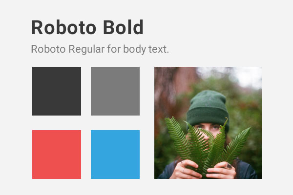
In our example we're using in this tutorial, we're creating a presentation design for a startup which sells bottled juices. The existing brand has a strong focus on warm colors as it's a product which is supposed to make people feel good about themselves. We can express these types of emotions through bold typography, warm colors and using photography in which people are in situations they feel happy.
3. Wireframe Your Presentation Slides
We have a story and a visual direction for our deck, the next step is to define the presentation structure.
The most efficient method I've found is to use paper and pencil to simply start sketching different slides. The idea is to rapidly prototype a number of presentations of how the slides will look structurally. I challenge myself to not spend more than 15 seconds per slide. I draw rough lines to indicate where text is placed, where visuals are placed and how I'm dividing the story into different slides.
Once I have a number of variations, I pick the best ones and start defining what the different slide templates will be. For a deck of around 20 slides for example, I typically have about 4-6 template slides I use to create the full presentation.
The idea is that you draw for about half an hour and then start with the production design of your Keynote presentation.

For this tutorial and the creation of our startup deck, we're going to be focusing on two example template slides to design:
- full-width photography slide
- features slide
In a full project, you'll often will have more template slides, but showing how to design these two will give you an understanding of the process.
4. Design Your Keynote Presentation Template
Now we have all the assets we need! We have the content and corresponding story. We have an idea of the visual elements we'd like to use as well as the structure of the presentation. Now, it's time to get designing!
Design the Photography Slide
One of the slide templates we need to design features a full width photograph with a color overlay on top. Let's dive in.
To design a presentation template in Keynote, we'll be using master slides. Let's learn a little bit more about that workflow.
Working With Keynote Master Slides
First open Keynote, I typically start with a wide, white document. Next we’ll set up our master slides. A master slide is a slide template you can reuse. By default Keynote provides a number of options when you tap on the plus icon to add a slide in the upper left, those are all different master slides.
With master slides you can design your slide layout options, and give your Keynote template a number of predefined options. The advantage is that you can setup where your text and photos will go as placeholders in various slide layouts, so you can keep your presentation design consistent.
If you're creating a large Keynote template for use on a number of presentations, then multiple master slides can be quite useful, especially if you're going to hand the theme off to a client to use or sell it on an online theme marketplace, as the layout of pages are locked while it's still possible to change the content.
Step 1: Set Up Your Master Slide
The first step is to start editing your master slides. To do this, left-click on the initial slide appearing on the left sidebar and click on Edit master slides. In this interface, you can easily edit any of your slides and later add them in the deck using the Add slide button which has the plus icon. Use any of the existing templates, or right-click on any of the master slides in the left sidebar and choose New Master Slide.
Now we'll set up the initial master slide.
First we need to find a photo we can use. I highly recommend Unsplash as a source to find photos to use as you please. Of course, there are tremendous amount of ways to find photos online (or you can buy stock photography).
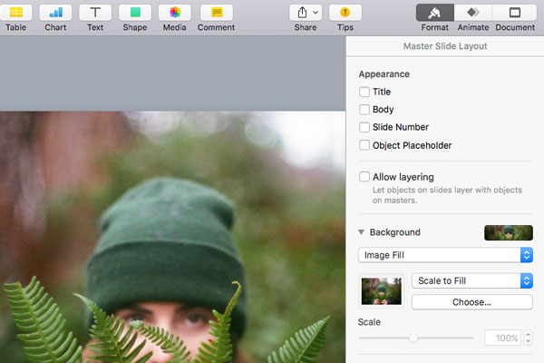
Once you have a photo you'd like to use, delete all the existing text boxes in your master slide. Now, let's add a photo to the background of the slide.
First, click on the Format tab on the right side of the Keynote window. You should see Background as one of the options. When you click on the arrow to display the options, you are able to select Image fill. You can upload your photo of choice and it will appear in the background of the master slide. Finally, you have to assure the photo fits correctly. Choose Scale to Fill as sizing option and we're all set!
Step 2: Add Branding Elements and Color
Now we'll add some color. Press the Shape tool in the top toolbar and click on any square. A new menu opens on the right to manipulate the shape. Let's make sure the shape works for us:
- In the style menu, click on the Fill and select No Fill.
- Also, select Shadow from the dropdown menu and apply No Shadow.
- In the Arrange menu, make the position 0 and 0 across both axis. Also, make the size of the shape 1920 by 1080.
- Now, back in the style menu, let's add the primary brand color. Select the Color Fill and press on the Color Wheel so you're able to add your own color.

For the startup presentation template we're creating we are applying a bright red (#ee504f) for the primary color (as shown above in the branding guidelines). We'll add this as color to the shape. Next up, still in the style menu, change the Opacity to 65%. Well done, there's your color overlay!
Step 3: Add Your Text to the Master Slide
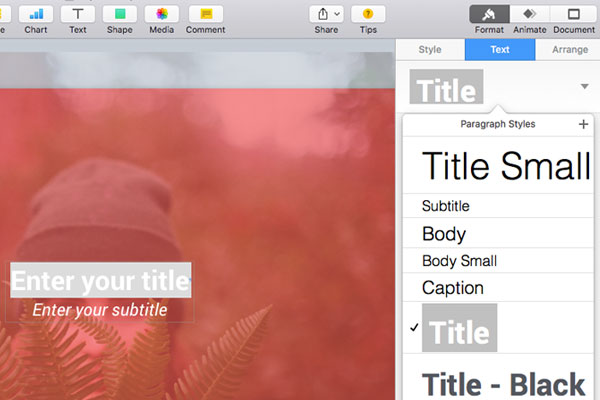
Now, let's add some text. Click on the Text tool in the top bar to have a text field appear on top of the slide. The font of our brand for titles is Roboto Bold, so I'm changing the typeface to this font.
I'm going to increase the font size to 72px to give the title a little bit more punch. Finally, I'm changing the font color to white as it provides a better contrast with the red background. To reuse this style in the future, I'll be adding this style as a new Paragraph Style.
On top of the text tab there's a small dropdown you can click on to display diverse paragraph styles. Tap on the little plus icon to add yours, give it the paragraph style a recognisable name (such as Title for example) and you're good to reuse it elsewhere!
Write down "Enter your title" as a placeholder text to define the purpose of the copy.
Let's add a subtitle. Apply the similar steps as described above, but rather have a font size of 46px and choose Italic as font style.
Finally, an important step is to indicate the text is a placeholder. You need to do this manually for all elements you want to make editable when a user creates their presentation using the master slides you've designed. Click on the text, and over to your right in the style tab, make sure to check the Define as Placeholder Text. Save the master slide and you're all set!
Step 4: Duplicate Your Master Slide
Another way to easily scale your presentation is to duplicate your master slides and give additional color options. As an example, let's create a different color photography master slide.
First, right-click on the master slide you just designed in the slide list over to your left. Next, click on Duplicate slide. A duplication will appear right below the original master slide.
Note that all changes you make to the duplicated master slide won't affect the original master slide. It's an easy approach to create a number of variations of a master slide.
Step 5: Add a Unique Slide to Your Presentation
Great, first let's change the color of the overlay. Click on the box of color and change the Fill color to #34A5DF. Now, let's change the background photo. Click on the slide in the slide list over to your left, and you should see the background is set to Image fill. We can keep all existing settings and just upload a different photo of your choice by clicking the Choose button. Save the master slide.
Now, people can easily add different content in their presentation. For example:

Design The Features Slides
The next template slide we'll work on is a feature slide. In the feature slide, we're making a simple slide explaining three benefits of the bottled juices the startup is attempting to sell. For this, we'll create a new master slide.
Step 1: Add a New Slide Setup the Text
First, let's add a new slide to the deck by adding a new master slide. Right-click on one of your slides and add a new master slide. Remember the title paragraph style we created in the previous slide? Add text using the Text button in the top toolbar and use the dropdown to select the Paragraph Style 'Title' we've created.
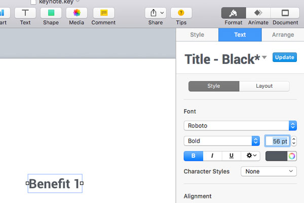
Now, as the font color was white for the title you won't see anything because of the white background color. Let's change the font color to black and create a new Paragraph Style (be careful to not update the old one) and call it Title - Black. Make sure to check Define as Placeholder Text as we did previously.
Considering that we would like to add three benefits on one slide, the font is a little bit too big. Let's reduce the font size back to 56pts.
Step 2: Duplicate the Title Text
Now, we need to duplicate the title and add two more benefits. Simply hold the Alt key and drag the title to duplicate. As you drag them around, you notice how Keynote helps you distribute them equally by displaying yellow guides. I've structured my titles as following (all on a x-position of 160 and distributed vertically).

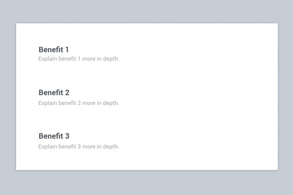
Step 3: Add Sentences
Let's add a single sentence description underneath each title. As you could see in the style guide, for the body text we use Roboto regular and a grey font color. Use Keynote tools to achieve the following result, assuring that the body text is also defined as placeholder text:
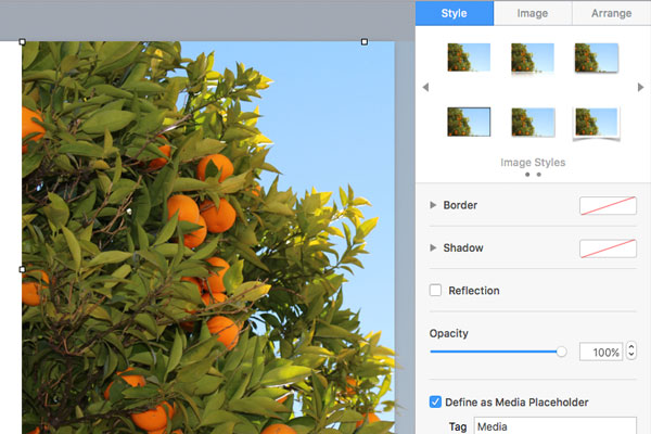
Step 4: Add a Photo
Now, finally let's add a photo which takes up the right side of the slide to complete the design. Similarly as we did with text before, you can check Define as Media Placeholder in the Style tab when you click on an image in order to make this easily changeable. Press Done to save your master slide.
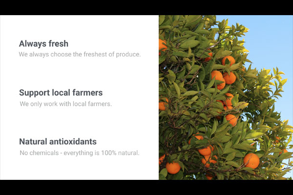
Now, when we use the master slide to start adding real content, it could look something like this:
Step 5: Rearrange to Add Variety
Now, let's duplicate the above master slide to create a variation. Enter the master slides screen, duplicate the above feature slide and let's rearrange some elements to create a different layout.
Practice your Keynote skills and recreate the following:

Step 6: Add Slides to Your Presentation
Now, finally go back to your presentation. Use the Add Slide button to add all of the master slides we've created. You can change copy as well as images.
For text, you can simply click on any of the text fields and type to change the copy. For images, you can click on an image, go to the Image tab and click on the Replace button to change the image used.
All done!
- By working with templates and master slides, you can reduce the time required to create a strong presentation, especially if you'll be creating multiple presentations from the same theme.
- Master slides are especially useful if other people will be working with the source file as they can work within the theme you designed using basic text editing and formatting skills.
- In most presentation scenarios, less is more (less words, more simple photography, and limited color selection).
- Working with color overlays (colored shapes with transparency) you can quite easily 'brand' your photography.
- Do a test run with your presentation! Often when presenting for the first couple of times, you might want to change a couple of things depending on how you like the flow of the presentation.
5. Should You Use Keynote Animations?
With that, we have our template mostly complete, which we can reuse to design the full presentation. There's one final step: Adding animations.
Using animations in Keynote is tricky. As easy as Keynote makes it to add animation to your slides, the first question you should ask is whether you should. It's important to consider if animations add value to your presentation or not. Animations could distract your audience or interrupt the flow of your presentation. Try it yourself and see if it works!
There are two types of animations:
- Transition animations which animate the transition between two slides.
- Emphasis animations in slides directly, which either build in, build out or perform an action in the slide itself.
Step 1: Add a Transition Animation
Click on one of your slides on the left and then click on the Animate tab in the top right of the interface. There's a large button Add an Effect which upon clicking opens a large dropdown with diverse transition options.

Choose any animation and you can tweak the animation as you please in the tab on the right. Typically I make the Duration a little bit shorter (0.5s) to make the presentation a little bit smoother.
Step 2: Add an Action Animation
Now click on an element within the slide, such as text for example. When you select an element in a slide, there are three new tabs added in the right pane. Build in, Action and Build Out. Either bringing elements in or out of the slide, or add emphasis to an element.
Use the same process as you did for the transition animation to add an Action to the slide, for example Pop is a pretty good one.
Animation is something which is a little bit tricky to get into as there are many options! My advice is to keep it simple and experiment a little. For animations, most of the time less is more!
6. Save Your Final Keynote Theme
Now it's time to save the template to reuse it at a later point, or use your current design for another presentation later by editing the master slides you've created. Simply click on File in the top menu bar and then click on Save Theme. Next, you can add it to the Theme Chooser. The next time you use Keynote, you can select this theme! You can also save it locally to your computer to make a backup in Dropbox for example.
That covered it! The above process makes it easier for you to design an effective presentation template. If you're looking for more inspiration, or would like to have access to great templates, check out the Keynote theme designs created by excellent presentation designers on GraphicRiver.

The following are some of my favorite examples:
Also, you can find more great Keynote templates in the post below:


Grab This New eBook on Making Great Presentations (Free Download)
It will will help you learn the complete process of how to make an effective presentation. Keep in mind that your design can only perform as well as your ideas, content, and delivery.
Should you have any questions, please ping me on Twitter! Thank you for your time.


