

Charts are visual summaries of our data. It's much easier to find meaning in a beautifully illustrated pie chart or bar graph than a list of data.
A well-placed chart in your presentation can help your audience have an "aha!" moment to understand your data.
When I have a large list of data, I frequently will throw it into a chart quickly to analyze it. If I'm looking for trends, or the largest part of the whole, it will quickly jump out in a chart. Charts are all about bringing meaning to your data.
One of my favorite tools to create charts is Google Sheets. It's free and lives inside your browser, so no need to purchase another tool like Microsoft Excel. In this tutorial, I'll teach you how to use Google Sheets to easily create attractive charts.
How to Quickly Make Google Sheets Charts (Watch & Learn)
If you want to get started with charts in Google Sheets, check out the screencast below. I'll walk you through creating your very first chart inside of Google Sheets.
The tutorial below has more examples of how to use charts in Google Sheets. Read on to become a master of visual data.
Jump to content in this section:
How to Make Your First Google Sheets Chart
If you've not created your Google account, start off by jumping over to the Google Drive homepage. You can login with your existing Google account or create a free Google account to get started.
1. Create a Sheet
After you've logged into your Google Drive account, create a new sheet by clicking on New and choosing Google Sheets. This will create a new spreadsheet where you can add your data, and then build charts utilizing that data.
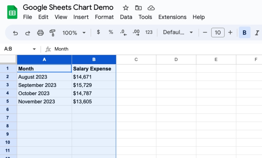
2. Add Your Data
Every chart begins with data inside of a Sheet. Each record should be on its own line in the spreadsheet.
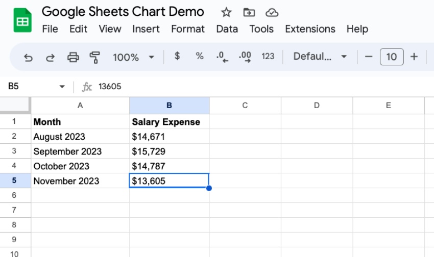
If you want the chart to show a summary of your data, make sure and group the data before creating a new chart. For example: sum up your results by month instead of using each individual day will keep your chart nice and clean.
3. Highlight the Data
After you've logged your data inside of a spreadsheet, highlight the columns that you wish to include inside of your chart. My favorite way to do this is simply to click on the column headers (the vertical lines with letters above them) and highlight them.
It's best to highlight the entire column. This way, adding more rows to the data later on will automatically include them in the chart, and it will update in real time.
You can also highlight only the columns that you want to include your data. Click on a column to include it in the chart, and then hold Ctrl on Windows (Cmd on Mac) and click on another column header.
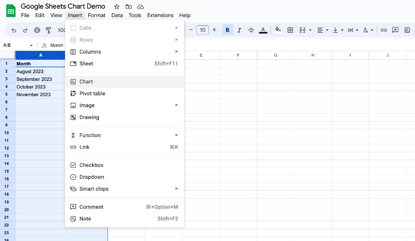
4. Choose Insert > Chart
Once you've selected your data, find the Insert menu just above the spreadsheet. Choose Chart to insert your chart into your Google Sheets.
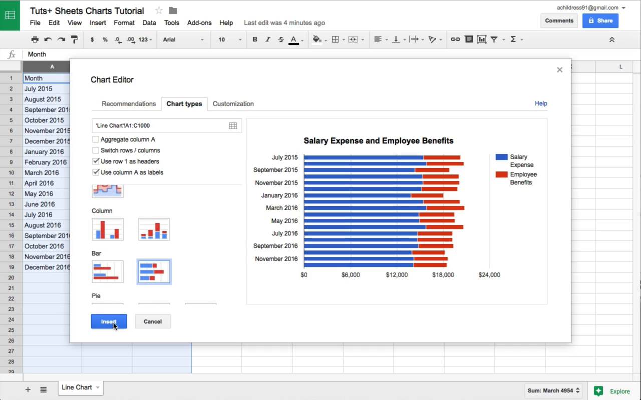
5. Choose a Google Sheets Chart Format
When you click Insert, you’ll see Google Sheets insert a chart. What Sheets does is pick a certain chart style based on your dataset. In this instance, you can see that Sheets added a column chart. But you may find yourself wanting to change the format of your chart.
Easy! With the Google Sheets stacked bar or column chart added, you can change the type. These options are found in the new sidebar that’s opened on the right side of your screen. It’s labeled Chart Editor, and you’ll want to work on the Setup tab.
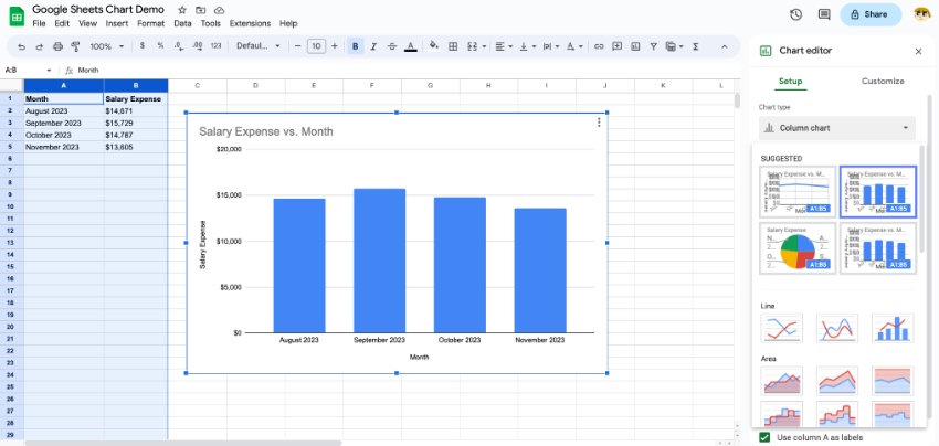
On the Setup tab, open the Chart Type dropdown menu. At the top of the gallery, you’ll see several recommended chart designs. Again, these are layouts that Google Sheets thinks will best portray the given data.
Below, you can choose from a wider array of charts. Browse the thumbnail previews and click on one that you want to use. When you do, you’ll see your chart transform.
On the sidebar below, you’ll see more options. For example, you can choose to stack bar graphs. Plus, you can control how a data series is displayed. And you can make quick edits like the addition of headers, and even the range of data included in your Google Sheets chart.
6. Customize Your Google Chart
With a Google Sheets chart added, you can smoothly customize it. This helps you add your own personal style to any chart that you’ve built. What’s more: you can use these features to control exactly how your data appears.
To access these options, return to the Chart Editor sidebar on the right side of your screen. This time, open up the Customize tab. Here, you’ll see a plethora of options, contained in their own menus.
For example, on the Chart Style pane, you can change features like the background color, border color, and font used in the chart.
The Chart & Axis Titles menu lets you add supporting text details, as does the Legend option. Browse through these menus - if you’re looking for a layout or style design option, odds are you’ll find it here on the Customize tab.
That’s it! In moments, you’ve learned how to create a chart in Google Sheets! It’s fast, easy, and gives you full creative control as you present your data. Now, it's time to think about how best to use them and how each type differs. Let's keep learning.
7 Common Types of Google Charts (And When to Use Them)
Google Sheets allows you to create a variety of different charts. Here are visual examples of each type of chart with guidance on when you might use each one.
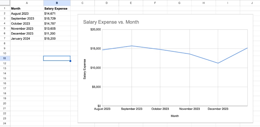
1. Line Charts
- When to Use Them - To show your audience how the data has changed over time.
- Example - Show the company's salary expense, month-by-month.
A line chart is great for time series data. Want to see how your company is performing each month? You could plot the revenues over time to show the fluctuations in the company's results.
2. Area Charts
- When to Use Them - Visualizing two related parts that make up a total.
- Example - Show the total employee cost by stacking the salaries and benefits.
Area charts give you a sense of scale by coloring in the area below the lines. I like to use these to "build up" a cost or amount by stacking the bars on top of each other.
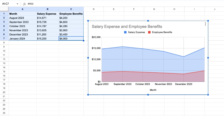
Sheets features a variety of ways to present area charts. In the example above, I've got my employee costs illustrated in a chart. The combination of salaries and benefits are the total employee cost.
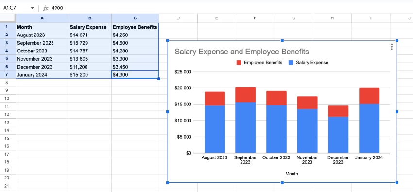
3. Column Charts / Bar Charts
- When to Use Them - Showing the height of each item and comparing it to related items.
- Example - Use a stacked bar chart to represent the values of your daily steps, easily comparing it other days.
Column and bar charts are similar, as they use vertical lines to show values. Column charts use vertical lines, while bar charts are horizontal lines. In either case, they can help you understand the magnitude of the items they represent.
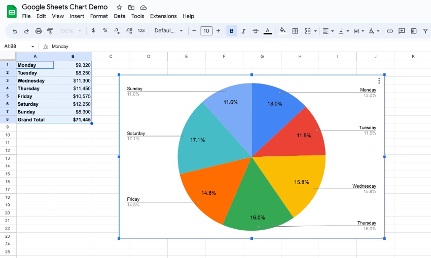
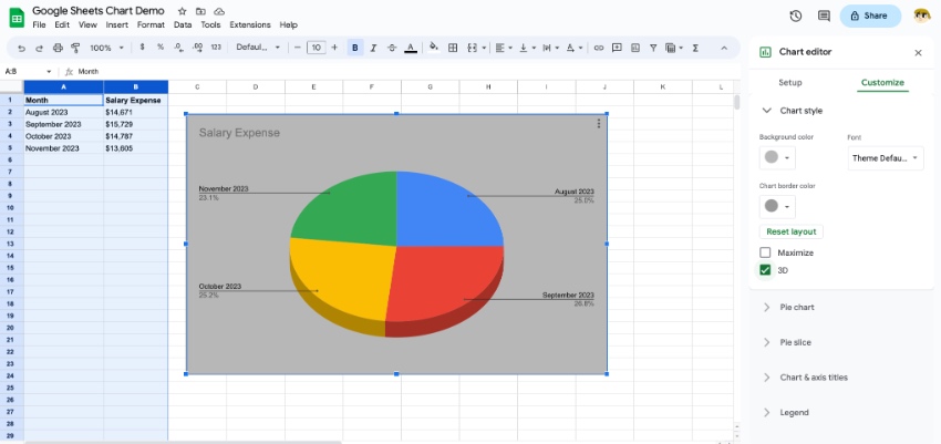
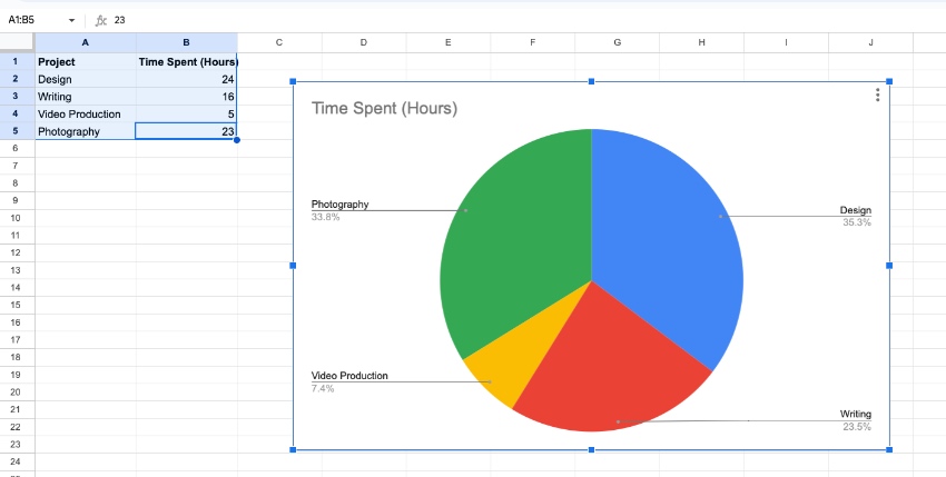
4. Pie Charts
- When to Use Them - Showing how the parts relate to the whole.
- Example - Showing the percentage of your time you spend on each project.
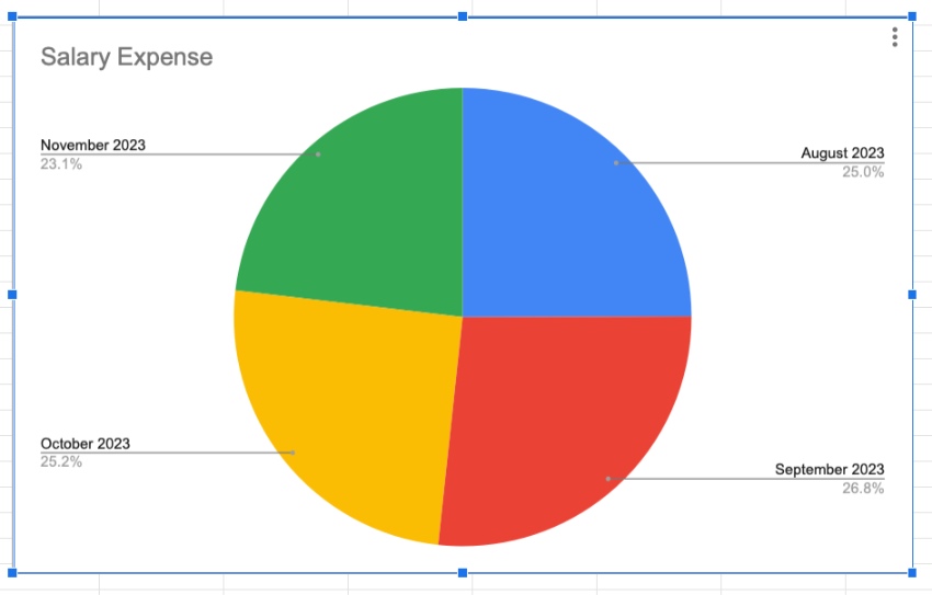
A pie chart is a classic presentation tool, showing how the parts of data relate to the whole. It's important to learn how to make a pie chart in Google Sheets for these types of comparisons.
You can use a Google Sheets pie chart to draw attention to how much time is being spent on certain types of work, for example. The pie chart in Google Sheets gives you an easy visual to divide the whole.
A Google Sheets pie chart will automatically help you calculate the percentages. If you want to learn how to make a Google Sheets pie chart, keep this in mind: your data should divide into categories on rows, with numeric values in columns.
5. Scatter Charts
- When to Use Them - When you have data with two variables to present.
- Example - Showing the number of customer engagements compared with total sales.
Scatter charts show the intersection of two variables. What they really do is illustrate how one factor changes when another changes. It helps you understand (and visualize) the relationship between multiple inputs.
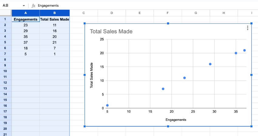
Here, I’ve tracked how many sales are made relative to how many customer engagements a sales team has. This shows correlation: the more total customers that are contacted, the more sales are made.
6. Table Charts
- When to Use Them - Showing data in a clear layout, but in text form.
- Example - Mapping data that isn’t fully numerical, like employee names and ID numbers.
Not all data is numerical. But that doesn’t mean you can’t make charts for it! Table charts present data in the familiar row-and-column format we all know from using spreadsheets. But they elevate the style and help key data points stand out.
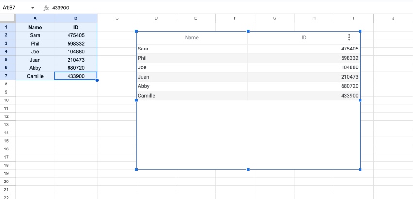
Above, you can see that I’ve made a Google Sheets chart table. At a glance, readers can match employee names with their numbers. This type of data wouldn’t be possible to illustrate with numbers-based chart designs.
7. Organizational Charts
- When to Use Them - Introducing your team or roles within your team.
- Example - Showing the key job titles for your sales team.
Simply listing off roles and responsibilities can become tedious and confusing. That’s where Google Sheets organizational charts come in. With these, you can visually show how your team interacts and works together.
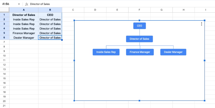
Organizational charts are powerful ways to map out organizations. They’re elegant and simple, and easy for all to understand.
Which Google Sheets Chart Type Should I Use?
Choosing any chart does come down to personal choice. Many of the styles have overlap in how they could be used with your data. It's easy to switch between chart styles or tweak the specifics in Sheets.
My top tip for using charts is to start by thinking about what you're trying to tell the audience. Think about what that data means and choose Google chart styles that convey that message.
The Top Source for Stunning Digital Assets (With Unlimited Downloads)
The best way to work more efficiently is to use a premium template. And the best source for these is Envato Elements. Elements is a creative powerhouse with a winning offer: unlimited downloads.
For a flat monthly rate, you can download and use as many premium templates as you want. These include thousands of Google Slides designs that are easy to use along with Google Sheets.
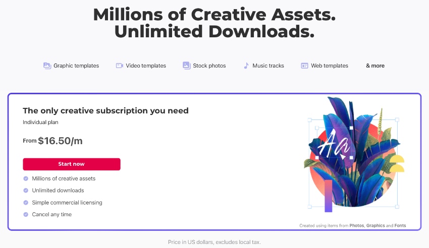
That isn’t all! Elements also includes stock photos, fonts, music, graphics, and so much more. In total, there are over 14 million digital assets to choose from! All are available for one low monthly fee.
Google templates from Elements are unbeatable. Why? Because they deliver premium styling that you’ll never find with free options.
When you choose a premium Google Slides template from Elements, you’ll enjoy:
- Easy-to-edit styles. Google Slides templates are incredibly easy to edit. You’ll simply need to drop in your own data. Designs and slide layouts are already built for you. You can easily integrate Google Sheets chart designs that you’ve built in that app.
- Sleek designs. With cool, modern designs, Google templates help your data look its best. And they’re sure to wow any audience.
- Intuitive layouts. Layouts built into premium templates are intuitive to work with. Plus, they help you maintain full creative flexibility. You can move design elements around to share data exactly how you want to.
As you can see, Envato Elements is the ultimate source for Google Sheets chart templates, and so much more. Many of the assets even add to your Google Sheets charts! Browse the vast library and join today.
Learn More About Google Sheets
You learned how to make a graph in Google Sheets designs! It’s quick and easy. But this is only one of many powerful features that you’ll enjoy in Google Sheets. The app is immensely powerful, and it’s simple to use from anywhere. That’s thanks to the online, cloud-based tools that form Google Sheets.
To learn more about Google Sheets and elevate your spreadsheet game, check out these other great Envato Tuts+ tutorials. They'll supplement all of the skills you just learned about how to create a chart in Google Sheets.
 How to Track Stock Data in Google Sheets - With GOOGLEFINANCE Function
 How to Use IFTTT With Google Sheets
 Turn Your Google Docs Form Responses Into Beautiful Visualizations
 How to Quickly Convert Excel Spreadsheets to Google Sheets
 How to Use Conditional Formatting in Google Sheets
Now You Know How to Make a Chart in Google Sheets
And that's not all. You also know how to make a graph in Google Sheets. As you can see, there are countless options available to really bring your data to life. Pie chart in Google Sheets designs - and many other chart types - illustrate ideas in new and creative ways.
Charts are great for all audiences, especially visual learners. They help you keep your slide decks more interesting and engaging. And they’re incredibly easy to build. They pair perfectly with digital assets from Envato Elements.
So, what are you waiting for? Start making pie chart in Google Sheets designs today! Or any of the other six chart styles we covered.
Editor Note: This post was originally published in April of 2017. It's been completely reviewed for accuracy and relvancy by Andrew Childress.
 By
By


