One of Google Docs best features is its forms, which are a free way to survey your users and gather information. The survey data is then automatically saved into a Google Sheets spreadsheet, where you can put the data to work—and that's where things get really interesting.
Unlike most form apps where you'll simply get a list of your responses, Google Sheets lets you turn your data into charts and other visualizations in seconds.
It'll take a bit of extra effort, but once you're done, your form will be far more powerful than just a form. This tutorial will show you everything you need to turn your Google Docs form responses into beautiful visualizations, no other apps needed.
We detail every step you need to take in this tutorial, but first we highlight another tool you could use that's quicker:
Looking for a Shortcut?
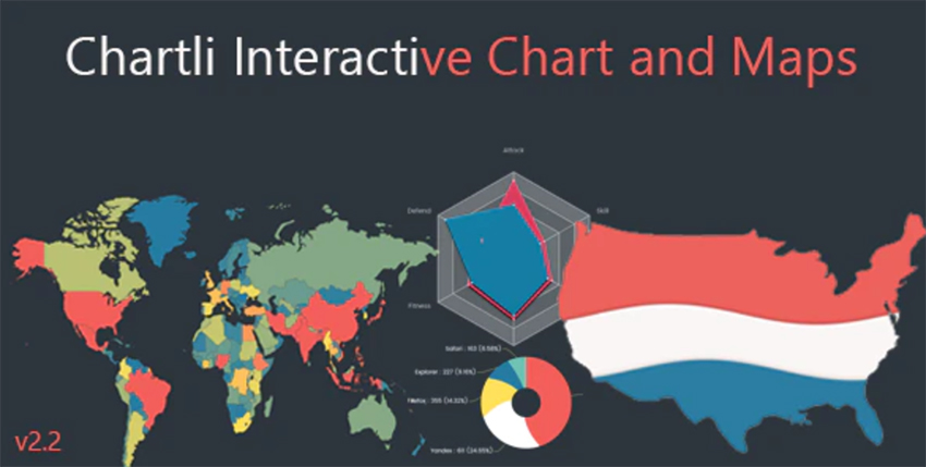
If you want a quick, easy way to create beautiful charts from form responses and display them on the web, try the Chartli plugin on CodeCanyon.
Chartli is a powerful jQuery plugin that lets you create your own interactive line, bar, pie, radar, map, cone, chord, and other chartsm quickly and easily. You can evene animate charts and have interactive chart elements!

If you'd prefer to create the charts yourself from scratch, then read on for the full process, starting with how to choose the right form questions:
1. Pick Your Question Types Carefully
It all starts with your Google Docs form. If you there are certain questions that you'll want to show a graph of Google Forms responses for, my recommendation is to use a multiple choice, scale, choose from a list or check box question type.
The reasoning behind this will become apparent later on, but for now, take my word for it. Think of it like grading a test—the multiple choice questions provide quick data with no room for variation—there are only so many responses available!
If you used a text box question type, even for a simple question like "How old are you?", answer formats will vary depending on the respondent and would therefore be difficult to chart (ex. I am 12, 11 years old, thirteen, and more).
Before you move on to the next step, make a quick note that we have two related tutorials to read next. The first gives instructions on using Google Forms to create a survey, and then next one will show you how to use Google Sheets to make great charts:
 How to Make a Survey With Google Docs Forms
 Andy Betts21 Mar 2017
 How to Make Professional Charts in Google Sheets
 Andrew Childress07 Jul 2023
2. Name Your Range
Once your audience has responded to the form, their answers will populate a Google spreadsheet.
In the first row of the spreadsheet, you'll see your original questions. In order to make the next part of the process easier, you're going to give each column a "nickname" or named range. If you were using the example from the previous step, the named range for the question "How old are you?" might simply be Age.
To name a range, highlight the question column and Google Forms responses that you want to graph. After highlighting the row, select Data on the toolbar, and then Named ranges.
.jpg)
Next, type in a short nickname for the column of data, and then select Done.
.jpg)
3. Add a New Sheet
Select the + sign at the bottom left corner of the screen to add a new spreadsheet.
.jpg)
4. Add Responses to Column A
On Sheet2, fill in all the possible answer choices to your original question. Each possible response answer will go in its own cell in column A. For example, the possible responses to the survey question I used were Strongly Disagree, Disagree, Neutral, Agree, Strongly Agree.
If you look at the picture below, you will see that I entered each response into its own cell, being careful to type the Google Forms responses exactly as they were written on the form.
.jpg)
5. Use =countif Code in Column B
Here is where things get a little tricky. In order to create a chart, you need to know how many times each response occurred. To do this, use a formula called countif, which will count your Google Forms responses from the previous sheet in the specified column. Once you apply the formula once, it can just be applied to the rest of your rows.
The countif formula requires two pieces of information: the name of the column you want the spreadsheet to refer back to (which is the named range from step 3) and the response you want it to count (which were typed into column A in step 4).
Next to your first response, which is most likely in cell A1, you will type in the beginning of the formula as =countif( . A dialogue box will appear with directions as to how to complete the formula correctly. You will continue the formula with the named range, followed by a comma, and the cell location of the Google Form response you want to count.
.jpg)
In my example, to count responses to Strongly Disagree, I would type in =countif(peasy, A1) because "peasy" was the name I gave my range in step 3, and A1 is the location of Strongly Disagree in column A. Finish the formula with a closed bracket, and the formula should be replaced by the number of times that response occurred.
.jpg)
Once you have completed this process for one cell, Google Sheets will automatically apply the formula to the rest of your cells. Hover over the square in the bottom right corner of your formula cell until a cross + appears. Then click down and drag the cross down as many cells as there are responses, and the formulas will pre-populate and count the Google Forms responses for you.
.jpg)
Once you have dragged the square down to the final response, you will see numeric values next to each response, representing the number of times each Google Forms response was given.
.jpg)
6. Create a Chart
Let's move on to learning how to make a chart on Google Docs Sheets. Now that the number of responses has been counted, you can create your Google Forms results graph using this data.
First, highlight all your cells, including the responses in column A and their respective values in column B. Next, select Insert on the toolbar and scroll down to Chart.
.jpg)
A new dialogue box, the Chart Editor, will open. From here, you will be able to select the type of chart you would like to be displayed. For my example, a column graph or a pie chart would display the data in an appropriate way. I chose a column graph.
.jpg)
7. Customize Your Chart
Finally, now we'll customize your Google Forms results chart using the Customize tab. Give the chart a title, add x-axis and y-axis values and titles, and change background or chart colors.
.jpg)
Once you have customized your chart, click Insert to return to the spreadsheet, where your Google Forms results graph will be displayed. (Note: You may need to use your cursor to drag your chart off the numbers on the spreadsheet.)
.jpg)
To save, copy or publish your chart, click the drop-down arrow at the top right corner of the chart.
.jpg)
Conclusion
Spreadsheets are incredibly powerful tools. But even better, combine an online spreadsheet with a simple online form tool, and you've got quite a powerful combination. That's what using Google Sheets paired with Google Forms offers. Next time you need to run a survey, give it a try, and leave a comment below if you have any trouble.
To learn even more about using Google Sheets, study:
Editorial Note: This post was originally published in 2014. It has been comprehensively revised by our staff to make it current, accurate, and up to date—with special assistance from Laura Spencer.


