Next lesson playing in 5 seconds

Cancel
  • Overview
  • Transcript

2.2 Build Market Info and Demographics

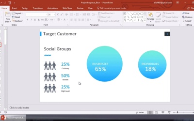
The market shows you the size of your potential opportunity, while demographics show the components of that market. Learn how to showcase your market and demographics with a slick slide in this lesson.

2.2 Build Market Info and Demographics

Now that we've built our executive summary, we've built the foundation for a winning marketing plan presentation. After introducing ourselves, we briefly previewed our position in a given marketing space. In this case, we're building out a marketing plan for Everylytics, a fictional startup designed to bring data analytics to everyone. Before outlining our own offering in greater detail, it's time to fit Everylytics into the greater marketing ecosystem. This starts with an analysis of market info and demographic data. This is a key part of a marketing plan and it essentially establishes who a potential customer base would be. When sharing marketing plans with investors, this is key to convince them of the profit potential. And when showing it to new hires on our marketing team, that's really key as well so that they understand who we are targeting. And finally, when sharing with customers it's essential to help explain how they might fit in to your vision. The template that I'm working in, ProjectProposal, includes a trio of slides that are really useful to present market and demographic information. Let's dive in. First up, let's go to this slide titled, Target Customer, here. A series of placeholders will appear here, including the social group ratios and the larger images here on the right side. For my uses, the human figures really don't fit in. Fortunately with pre-built templates these are easy to remove. I'll click on the left figure here, then hold down Control on my keyboard. Then I'll click on the other, and then press Delete on my keyboard. The figures will vanish instantly. Then I can resize these circles her to make them more proportional. I'll repeat the same multi-select technique and rearrange then on my slide as you are seeing me do here. This really just helps to fill in white space and make my content look great. When I'm finished I can go ahead and add custom content inside the circles. Using my own data, I'll change this one to read, Business 65%. And I'll repeat the process in the other circle making it read, Individuals 18%. Quickly you can see how easy it is to customize a pre-built template. These are statistics meant to represent the proportion of individuals and businesses using analytics to help them make decisions. As you can see, businesses are far and away more likely to use this type of data. The relative difference is illustrated by the size of the circles. You can adjust these to fit your own data of course. Whatever it says, it truly makes for an excellent visual representation of a concept. Over here on the left side I want to feature some data about the use of analytics. Let's imagine that I conducted a survey asking potential customers to gauge their interest in leveraging analytics data. To set the stage, I'll insert a new title here, Public Interest in Analytics. I can simple click on the placeholder, select it and type over with my own content as you're seeing here. Below I'll start adding in my own data. I'll start by changing this first box to 22%, and then below, I'll type somewhat interested. I can go ahead and repeat these same steps, inserting proportions and titles in the other two boxes. I'll jump on ahead here, and as you can see, I've built a compelling market case for my business using data. Next up, I want to explore market trends. I'll go to the next slide here and you can see these placeholders for the past four years. For me, I want to use them to illustrate the number of potential clients focused on using analytics. This is really a growth metric and something I can use to show the sustainability of my idea. I'll start off by adding a bit of contrast to the chart itself. I'll begin down here in the legend in the lower left corner. So to change one I'll simply right-click on the box. Then I can click on this fill box and choose something new from the color chooser, as you're seeing me do here. I changed the color of the first option. So what I'll do next is come up here and click on the first bar on the left hand chart. The fill button will appear and I can easily click to add the new color. I'll go ahead and repeat those steps across the other three charts so that they'll all match. Now it's time to edit my data to make the chart support my goal. To do this I can again, right click in the chart area. On the drop-down let's click Edit Data. A small window will pop up here. It's actually an embedded Excel spreadsheet that lives right inside of PowerPoint. For me these charts are going to contrast the growing interest in Everlytics and the much slower growth of actual users. This really demonstrates the potential of Everlytics by illuminating an untapped market with data. Region 1 here is the left column, and Region 2 is the right. Lets say in 2016, 30% of customers were interested in using analytics, but only 11% actually did. I'll type in those two numbers. Watch as the chart instantly updates and scales itself. Then I'll go on and repeat those steps for the other three charts, building out a map to a sustainable growth as you can see here. And finally, I can clean up the slides by deleting these percentages here at the top. They could also be used for titles, but in my case I'd rather move them entirely. I will also type a quick description here at the bottom to give meaning to my data. As you can see, building market info and demographics is a crucial way to capture attention. It introduces your potential and backs it with data. Everything we do in a marketing plan really comes down to focusing on users. And whether investors or new members of my team are checking out this deck, this will help paint a picture. Thanks for watching.

Back to the top