
 Lessons: 17Length: 39 minutes
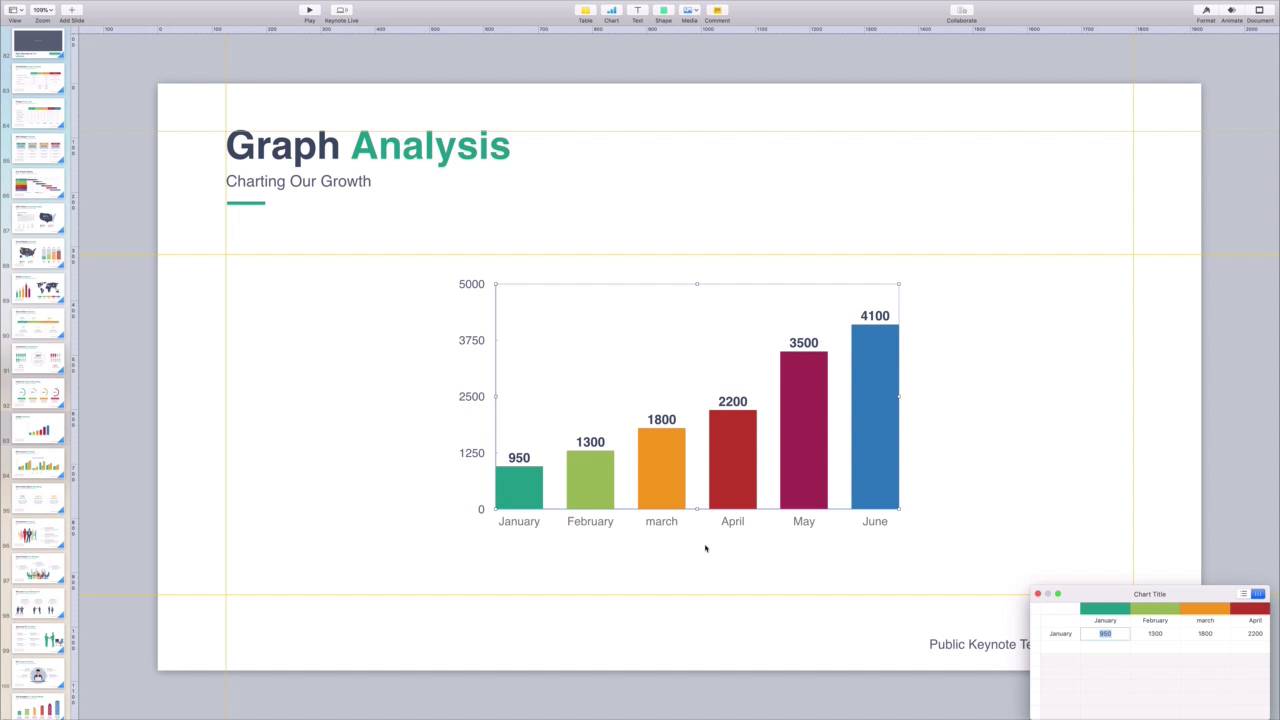
- Overview
- Transcript
4.1 How to Edit a Keynote Chart
Charts help you create visual stories with your data. Thanks to Keynote, they're easy to set up and customize. Learn how to use Keynote to create charts that bring meaning to your data and help your audience understand it.
1.Introduction
1.1Introduction00:58
2.Working With Templates
2.1How to Choose a Keynote Template03:02
2.2How to Edit a Keynote Slide Layout02:54
2.3How to Edit Keynote Slide Masters02:37
3.Working With Multimedia and Animations
3.1How to Add Music to Apple Keynote02:53
3.2How to Add Images in Apple Keynote03:14
3.3How to Use Apple Keynote Magic Move01:41
3.4How to Make a Video With Apple Keynote01:58
3.5How to Add a Background Image in Apple Keynote03:18
3.6How to Use Keynote Animations02:26
4.Building Charts, Infographics, and Custom Visuals
4.1How to Edit a Keynote Chart02:23
4.2How to Edit Keynote Infographics01:55
4.3How to Create Device Mockups in Apple Keynote02:22
4.4How to Add and Use Custom Fonts in Apple Keynote02:38
5.Presenting With Confidence in Keynote
5.1How to Add and Use Presenter Notes in Apple Keynote02:14
5.2How to Broadcast Your Presentation With Keynote Live01:55
6.Conclusion
6.1Wrapping Up00:39
4.1 How to Edit a Keynote Chart
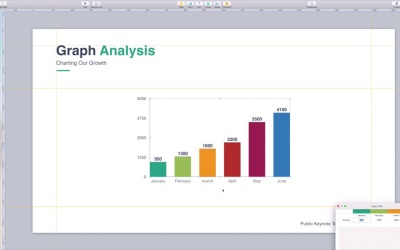
Charts are a great way to help visualize data. Trying to give a presentation while simply talking about numbers is often not effective. It really pays to have a visual aid to support your points and boost understanding. And with Keynote's robust chart-editing tools, you can create spectacular charts quickly. Keynote includes built-in chart templates that you can always use in any project. But if you're building out a data-driven presentation, it's best to use a professional template from Envato Elements. These custom keynote templates include designs built especially for charting. If you plan to include multiple charts, these are the perfect choice. They're sure to communicate your data clearly and concisely. Audience eyes are drawn to colors and images, so use that fact to your advantage. I'm working in the public keynote template, available now from Envato Elements. As you can see, there's a column chart here in the center of the slide. Now, this is just a placeholder chart, so these aren't actual values. I want to drop in my own data here to chart my total subscriber growth over the past few years. To change the chart data, I'll click once inside the chart I selected. You'll see this blue box up here that reads, Edit Chart Data. I'll go ahead and click on that now. Keynote will actually open up a little embedded spreadsheet app down here in the corner. This is that data that drives the chart. Now, all I have to do is swap out the example values with numbers of my own. For example, under January, I'll type in 13,000, in February 17,000 and so forth. As I work, KeyNote will automatically scale the chart to match my data. When I'm finished, I'll close out of this spreadsheet window. Just like that, I've made the chart my own. But in KeyNote, values aren't the only adjustment I can make to a chart. For example, I can manipulate it just like an image. I can click and drag to move it around the slide, or even pull on a corner to make it larger or smaller. I can also change the design elements. To do this, I'll simply click on the chart to select it. As you can see, Keynote opens up a new chart sidebar with a list of options on it. If I want to change the font, for example, I'll simply navigate to the chart font group and switch to a more readable option. I'll also change the colors by opening the color chooser here. Elements Keynote charts include amazing color palettes. I can preview each one just by hovering over it with my cursor. Don't forget to click this arrow here to see even more options. There are plenty of other design and style options to explore when editing Keynote charts, and you'll find most of them in this menu. Don't forget to spend time creating charts next time you're giving a keynote presentation. They visually improve your slides and keep your audiences happy. Thanks for watching.


