
 Lessons: 17Length: 39 minutes
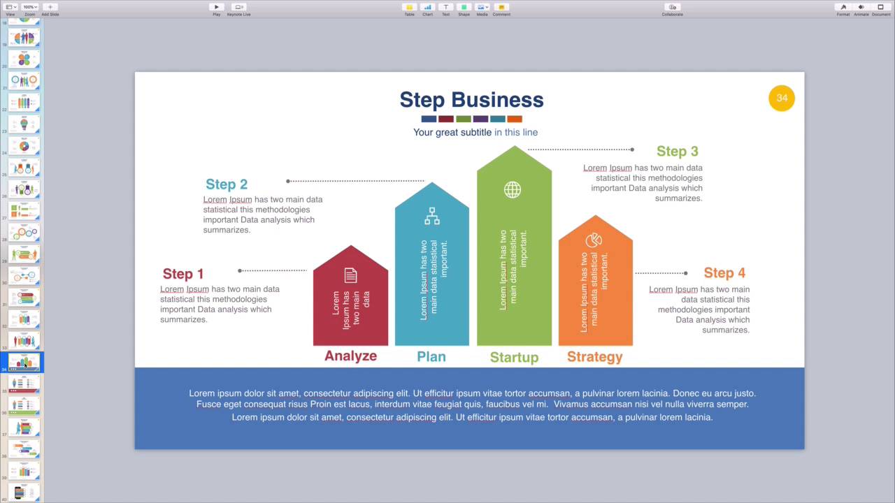
- Overview
- Transcript
4.2 How to Edit Keynote Infographics
An infographic helps illustrate a process or set of steps in your presentation. You can really jazz up bullet points and basic data with the help of an infographic. Learn how to use templates to create an excellent infographic in this quick lesson.
1.Introduction
1.1Introduction00:58
2.Working With Templates
2.1How to Choose a Keynote Template03:02
2.2How to Edit a Keynote Slide Layout02:54
2.3How to Edit Keynote Slide Masters02:37
3.Working With Multimedia and Animations
3.1How to Add Music to Apple Keynote02:53
3.2How to Add Images in Apple Keynote03:14
3.3How to Use Apple Keynote Magic Move01:41
3.4How to Make a Video With Apple Keynote01:58
3.5How to Add a Background Image in Apple Keynote03:18
3.6How to Use Keynote Animations02:26
4.Building Charts, Infographics, and Custom Visuals
4.1How to Edit a Keynote Chart02:23
4.2How to Edit Keynote Infographics01:55
4.3How to Create Device Mockups in Apple Keynote02:22
4.4How to Add and Use Custom Fonts in Apple Keynote02:38
5.Presenting With Confidence in Keynote
5.1How to Add and Use Presenter Notes in Apple Keynote02:14
5.2How to Broadcast Your Presentation With Keynote Live01:55
6.Conclusion
6.1Wrapping Up00:39
4.2 How to Edit Keynote Infographics
Infographics are graphics used to visualize data. They're perfect for illustrating key points and ideas. When you're giving a keynote presentation, talking through numbers and data can quickly grow dull. If not for you, then your audience may struggle to engage, understand, and retain. That's why infographics are key to delivering successful data driven presentations. Not only do they drive understanding, they also visually improve the appearance of your slides. Infographics come in all forms. Envato elements offers a fine selection of infographic templates, built to suit any situation. All you have to do is choose a template, and drop in your own data. I'm working in the infographics keynote presentation here, and as I scroll, you can see the stunning options on each slide. These include not only traditional charts, but process flows, mind maps and more. In my presentation I'm building I want to create a simple process flow that highlights my company's offering. This slide looks great, it's clean, simple, and the columns illustrate the proportions of each step. To make my own infographic, it's really as simple as swapping out the placeholder text for my own. I'll start down here by changing out these titles at the bottom. For the first, I'll type Engage. In the next slot we'll call it study, then plan, execute and so forth. Then I'll fill in the first descriptor text box under step 1. I'll match the title and then type a brief description in the box. Of course, if I wanted blank space instead, I can simply delete the text boxes and move on. Then, I'll just repeat these same steps, clicking in each text placeholder and adding my own. Finally, it's time to edit the text inside each column. It's a little tough to read since it's turned vertically, and I think it might actually look better blank. To empty out the columns, I'll click on the first text box. Then I'll press Delete on my keyboard, the icon symbol can be removed in the same way. I'll jump forward here having repeated the steps and the other three columns. I also added a title, as well as the descriptive text down here at the bottom. That's it. As you can see, keynote and elements make it easy to build custom infographics for your presentations in a breeze. Thanks for watching.


